A map tracker that turns everyday walks into world exploration.
Wayly blends a fitness tracker with a fog-of-war map: you don't just record a run — you uncover territory, plan routes and watch a personal map of the world light up, step by step. I took it from concept to a working app on a real device, solo: product strategy, design system, UI — and the Flutter code that runs it.
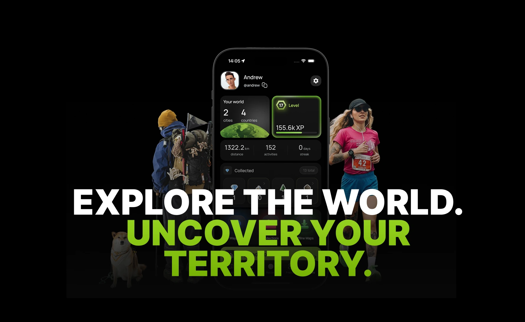
There are two camps of apps, and they don't talk to each other. Fitness trackers — Strava, Garmin, Nike Run Club — give you precise metrics, pace and social. But the moment a workout ends, the map goes dead: the run is logged, and that's it. Explorer apps — Fog of World, Jagat — have a beautiful map-reveal mechanic but a thin sport layer: no real workouts, no elevation profile, no route planning.
The insight it all started from: people who run and hike want their activity to accumulate into something visible. Not abstract kilometres in a table — a personal map of the world they slowly light up.

Building solo means every constraint is also a design decision.
Solo build → iOS and Android from a single stack. That choice (Flutter) shaped the component model before the first screen existed.
The #1 killer in this product category. It had to be a design constraint, not a bug found after launch.
So the whole UI is an overlay on top of the map — never separate pages that replace it.
Trails and mountains have no signal. Recording must work with no internet and sync later.
This isn't a classic designer-to-developer case. The value is precisely that the line between design and implementation is erased — I designed a solution and immediately verified it in code.
The design system wasn't born in a Figma vacuum: it came to life directly as a theme config and a set of Flutter widgets. When the iOS build crashed on launch, I diagnosed and fixed it myself — which means I owned the whole path from "drawn" to "runs on a real device."
Concept, persona hypotheses, a four-phase roadmap and the monetization model.
Screen map, navigation, state machines and edge cases — specified before the UI.
Tokens, typography, spacing and components — authored as a real Flutter theme, not a static library.
Building the app in Flutter (Riverpod, Go Router), integrating the map, GPS and the fog layer.
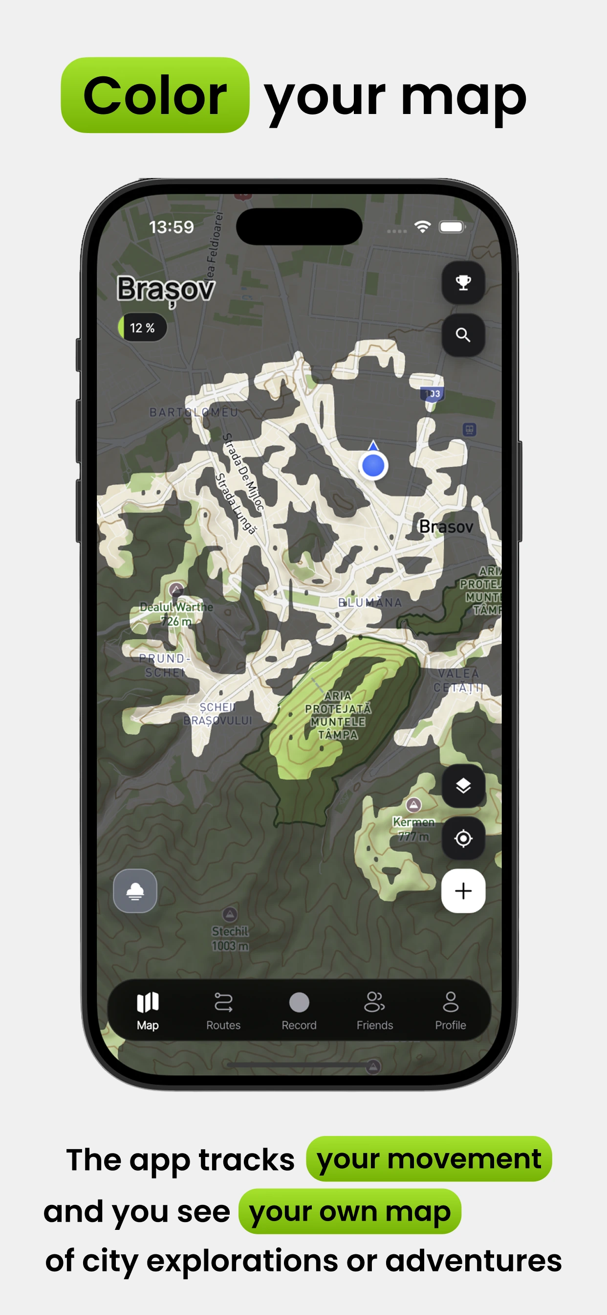
The fog of war runs on H3 hexagons at resolution 11 — roughly a 50 m radius per cell. Every GPS point maps to a hex index and marks that cell uncovered.
Hexagons read as more organic than squares, and they scale cleanly from a single street up to a whole country — which matters when the same mechanic has to feel right at both zoom levels.
The map is the product. Everything else is an overlay on top of it.
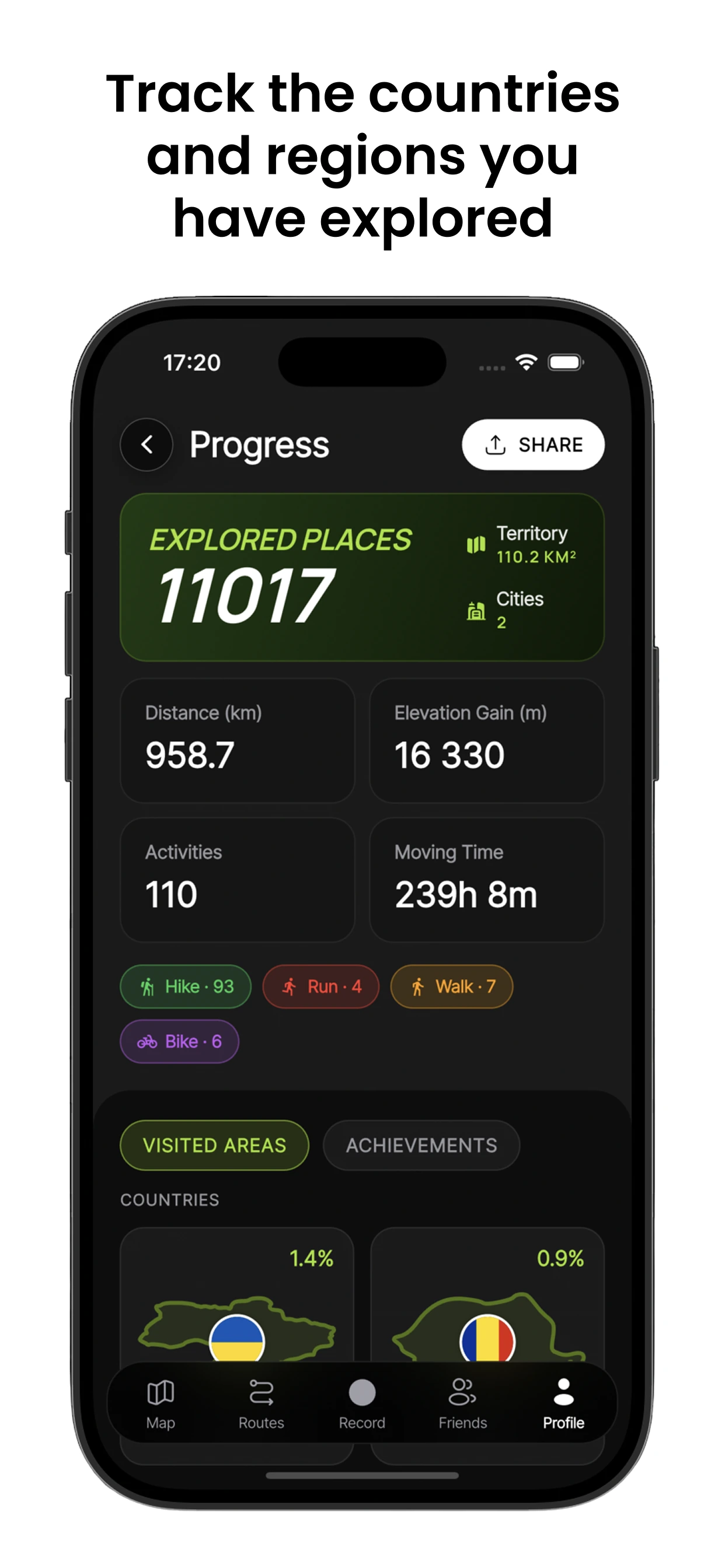
Route recording is integrated with the fog layer: every point of a tracked route reveals the map around the path. None of the reference apps do this — it fuses navigation and the explorer mechanic into a single loop, so planning a hike and uncovering the world are the same action.
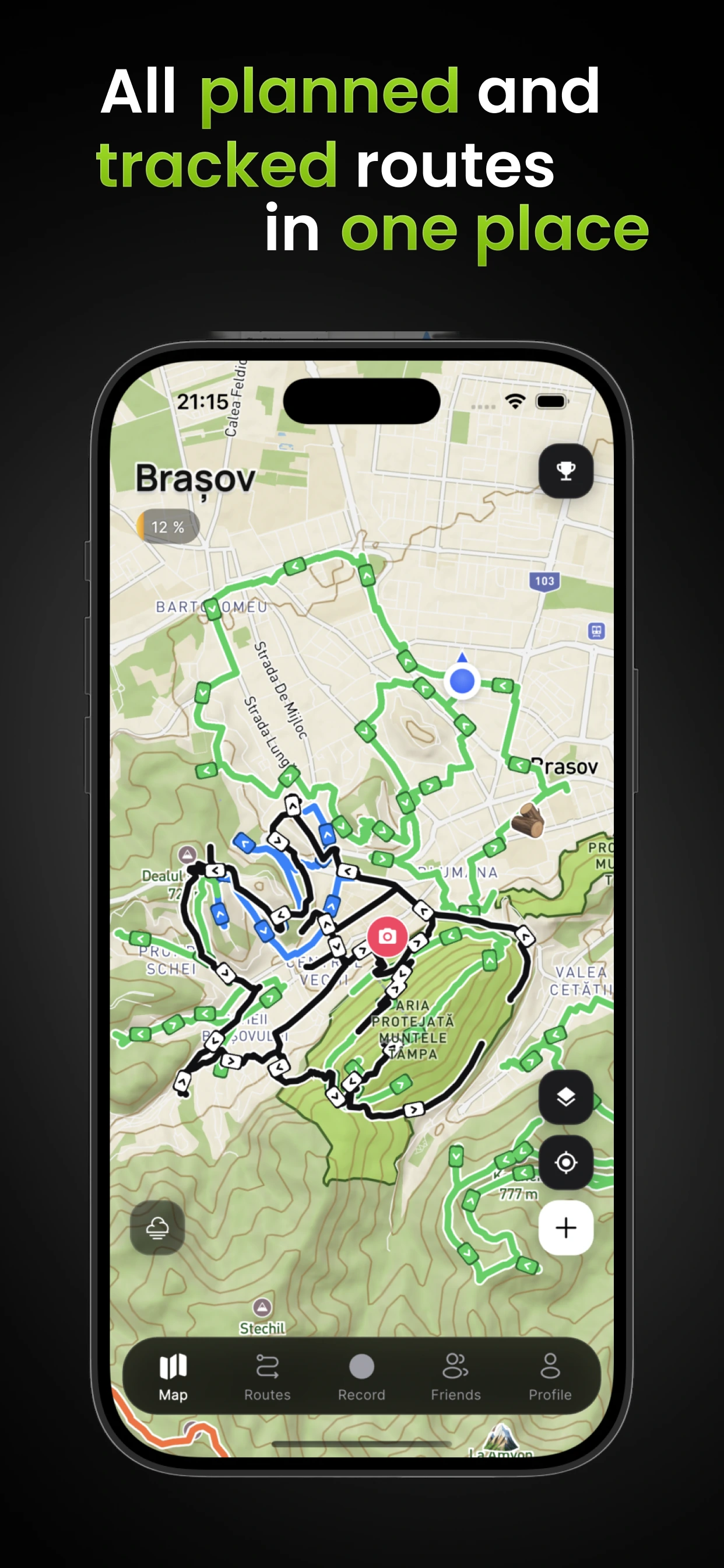
The route mode is the deepest part of the product, so I spec'd it as a standalone UX document — modelled as a state machine, which is a design and an engineering decision at once: Idle → Planning → Calculating → Preview → Navigating.
The user moves through it linearly but can always step back. A bottom sheet with three snap points (30% / 50% / 85%) keeps the map visible at all times and lets a single gesture control how much information is on screen. In trail mode the elevation profile is shown by default, because that's the product's signature scenario.
I specified the unhappy paths up front — no GPS permission, no route found, offline without a downloaded region, signal loss mid-navigation — so they were part of the design rather than a bug discovered in production.
The system is dark-first, map-centric and glassmorphic: panels float over the map as translucent surfaces so the sense of space survives.
But the important part is the constraints. The accent green is used only for GPS tracks and progress — never for CTAs. The reward amber is used only for achievements — never for navigation. Rules like these are what separate a design system from a colour palette, and they resolved most downstream decisions on their own.

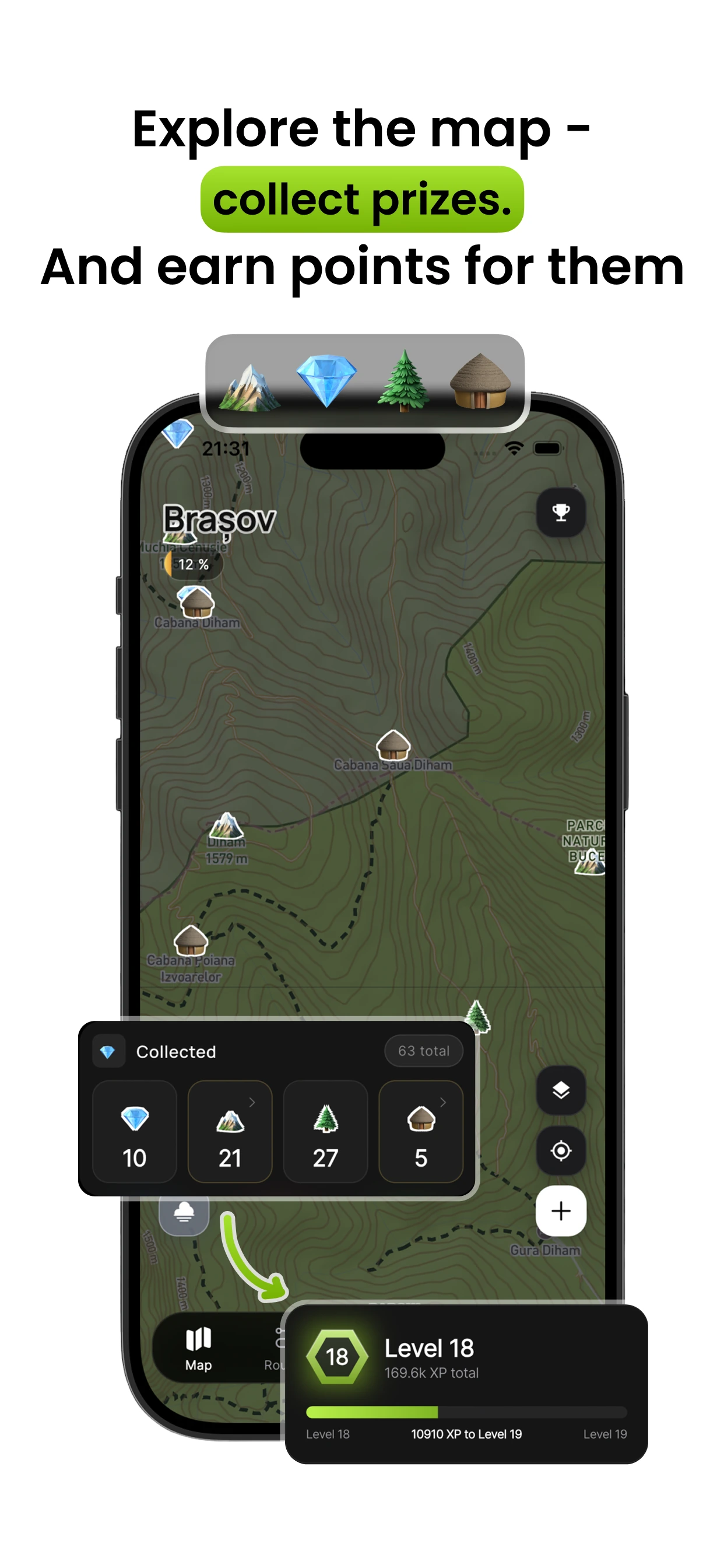
A working Flutter app — map with the fog layer, GPS tracking, activity recording and summary, route builder, profile and achievements.
A design system authored as code — tokens, spacing and radius scales, button variants and glass components, shipped as a Flutter theme rather than a static library.
A full UX spec for route mode — four phases, edge cases and the elevation profile — written before the UI was built.
An energy-aware GPS architecture — motion detection instead of constant polling, so the app isn't burning the battery while you stand still.
A freemium model that keeps the user's own data free forever, with Pro and lifetime tiers on top — plus the legal package needed for the stores.
When the design system is born directly as a theme and widgets, a whole category of handoff losses simply disappears. AI was a lever here, not autopilot — it accelerated architecture, boilerplate and build debugging many times over, but the decisions that define the product (hexagons over squares, a track that uncovers fog, strict colour-usage rules) were human ones. Constraints — battery, offline, "the map is always primary" — cut off dozens of wrong directions before the first mockup existed.