An appetite-first website for a casual restaurant — bold food photography, a mouth-watering menu showcase and a table booking built right into the page.
The goal was simple: make people hungry in the first three seconds, then get them to book a table without friction.
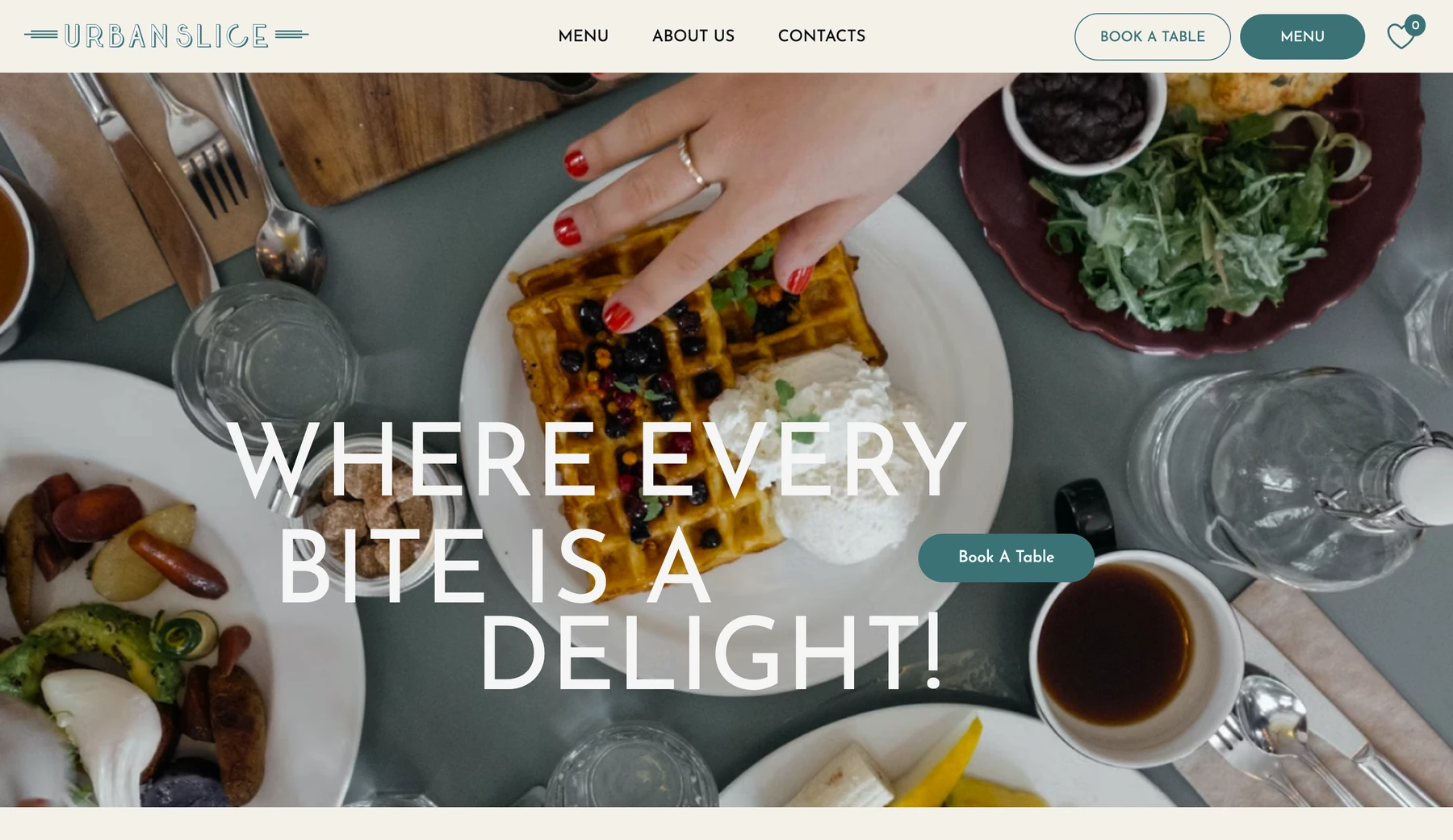
Urban Slice is a casual, feel-good restaurant. A site like this has one job before anything else: make you hungry. So the design leads with full-bleed food photography and a warm, cream-and-teal palette that feels welcoming rather than corporate.
Everything else — the menu, the story, the atmosphere — supports a single call to action: book a table.
A restaurant site has to seduce and still be effortless to act on.
The hero has three seconds to make a visitor want to eat here.
Dishes need to feel premium yet scannable — photo, name, portion, price.
Reserving a table shouldn't send people to a third-party tool.
Serif-and-script logo, cream backdrop and teal accent tie every section together.
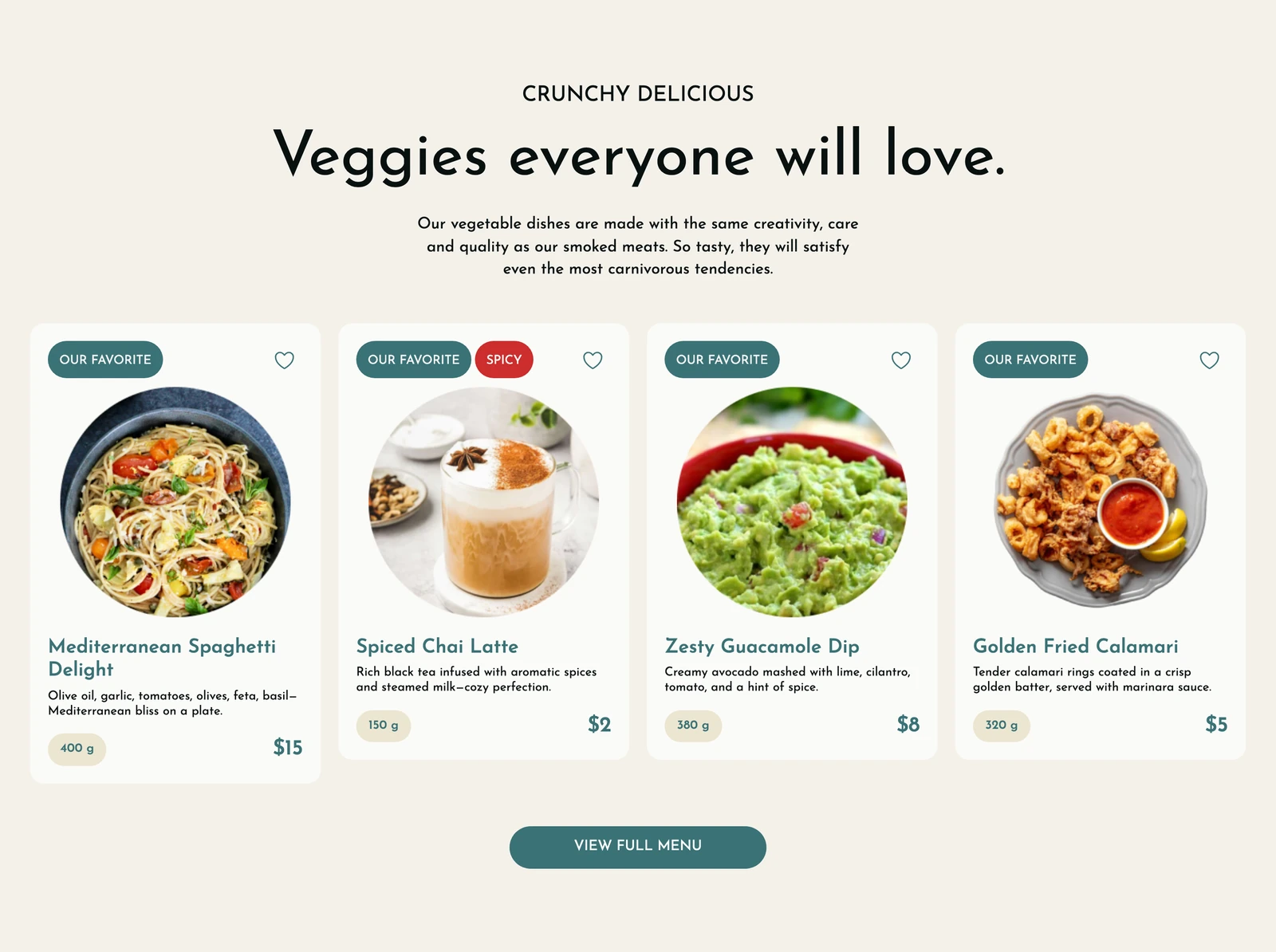
The menu is built as a set of appetising cards — each with a photo, a short tempting description, portion size and price, plus a "favorite" and dietary tags (spicy, vegan). It reads fast and still feels like a curated tasting.
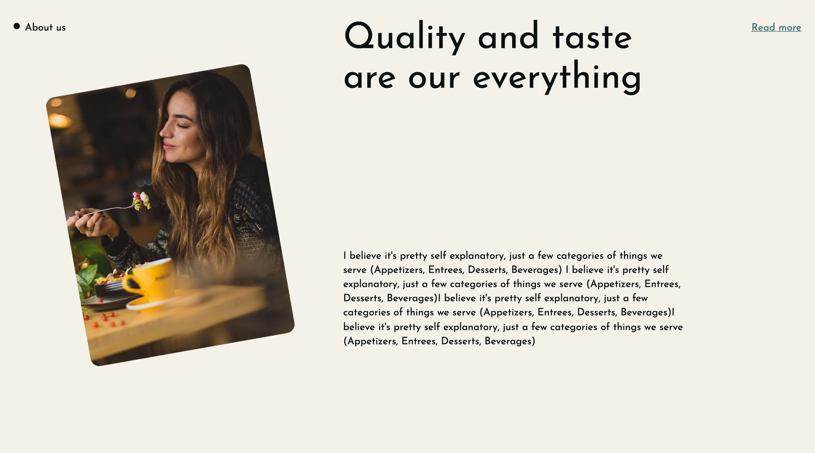
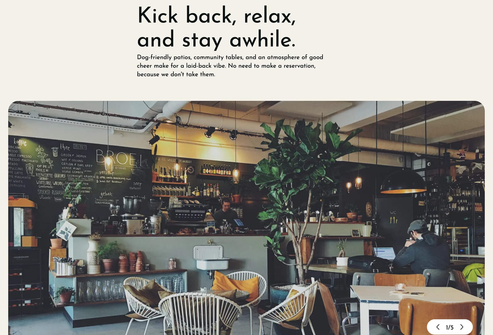
Below the menu, an "About" block tells the restaurant's story in a relaxed, personal voice, and an atmosphere section — with a photo gallery — sells the experience of being there: dog-friendly patios, community tables, a laid-back vibe.
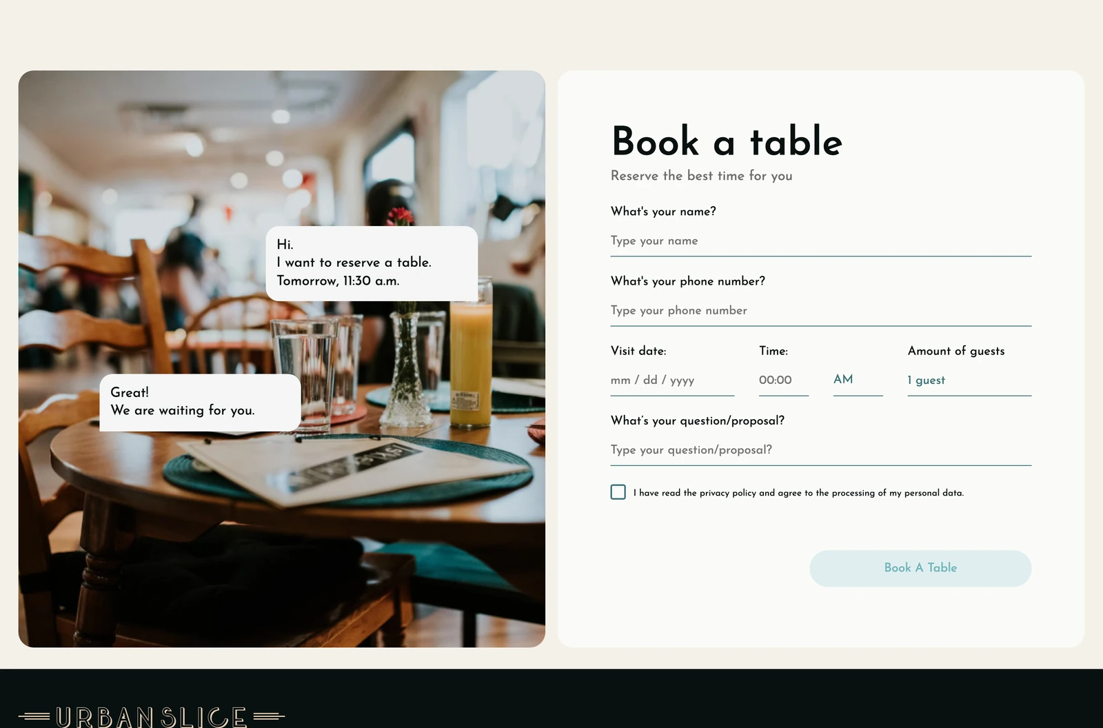
The reservation flow lives inside the site: name, phone, date, time and party size in one clean form, wrapped in a friendly chat-style illustration so it feels like talking to a host rather than filling in a database.
A bold, food-first landing that builds appetite in the first screen.
A photo-led menu showcase that stays premium and scannable.
An in-page table-booking flow — no third-party detour.
One cohesive warm brand across hero, menu, story and footer.
For a restaurant, the design's real job is emotional — make people hungry — and then make the next step (booking) so easy it feels inevitable.