Back to all cases
Mobile App · Website

Trekking Carpathians

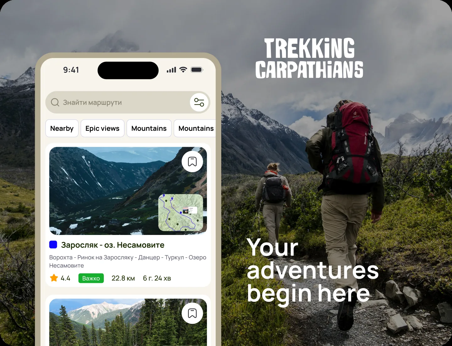
A mobile app and website that spread the culture of mountain tourism in the Ukrainian Carpathians.

Find routes, connect with other hikers, track your progress and get the information that matters on the trail — in one clear, consistent product.
Role
UX/UI Designer
Research → UI
Type
Mobile app + Website
Timeline
2025
Scope
Interviews · UI · Design system
Trekking Carpathians — preview
01 — Context

Spreading a culture, not just shipping an app.

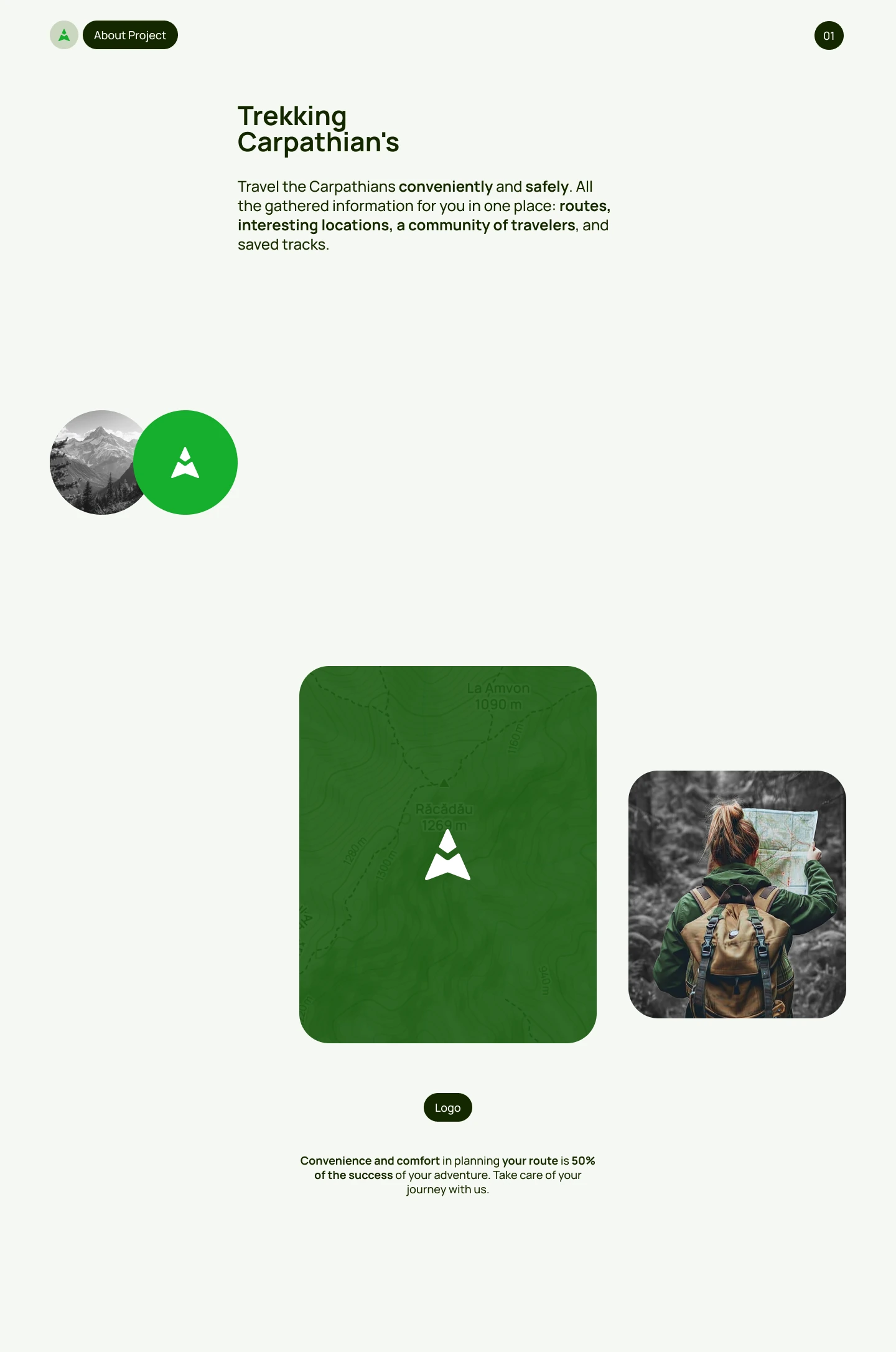
The product’s goal is bigger than a feature set — to popularize responsible tourism in the Ukrainian Carpathians. It had to serve first-time hikers and seasoned travelers alike.

Routes, community and progress tracking all needed to live in one place, without overwhelming anyone who just wanted to find a trail.

PreviewPreview
Project preview — visual concept and positioning.
Project overviewProject overview
Project overview — goals, audience and product scope.
Project overviewProject overview
Where the product sits and who it serves.
02 — Challenge

A capable app that had grown hard to read.

The old product packed in features, but buried them.

01

Poor information visualization

Weak hierarchy made the platform hard to perceive and slowed the target action.

02

Too many scattered functions

A range of features competed for attention and confused users.

03

No shared system

Screens were built ad-hoc, so consistency and development speed suffered.

04

One environment, many jobs

Routes, activities and community had to coexist without noise.
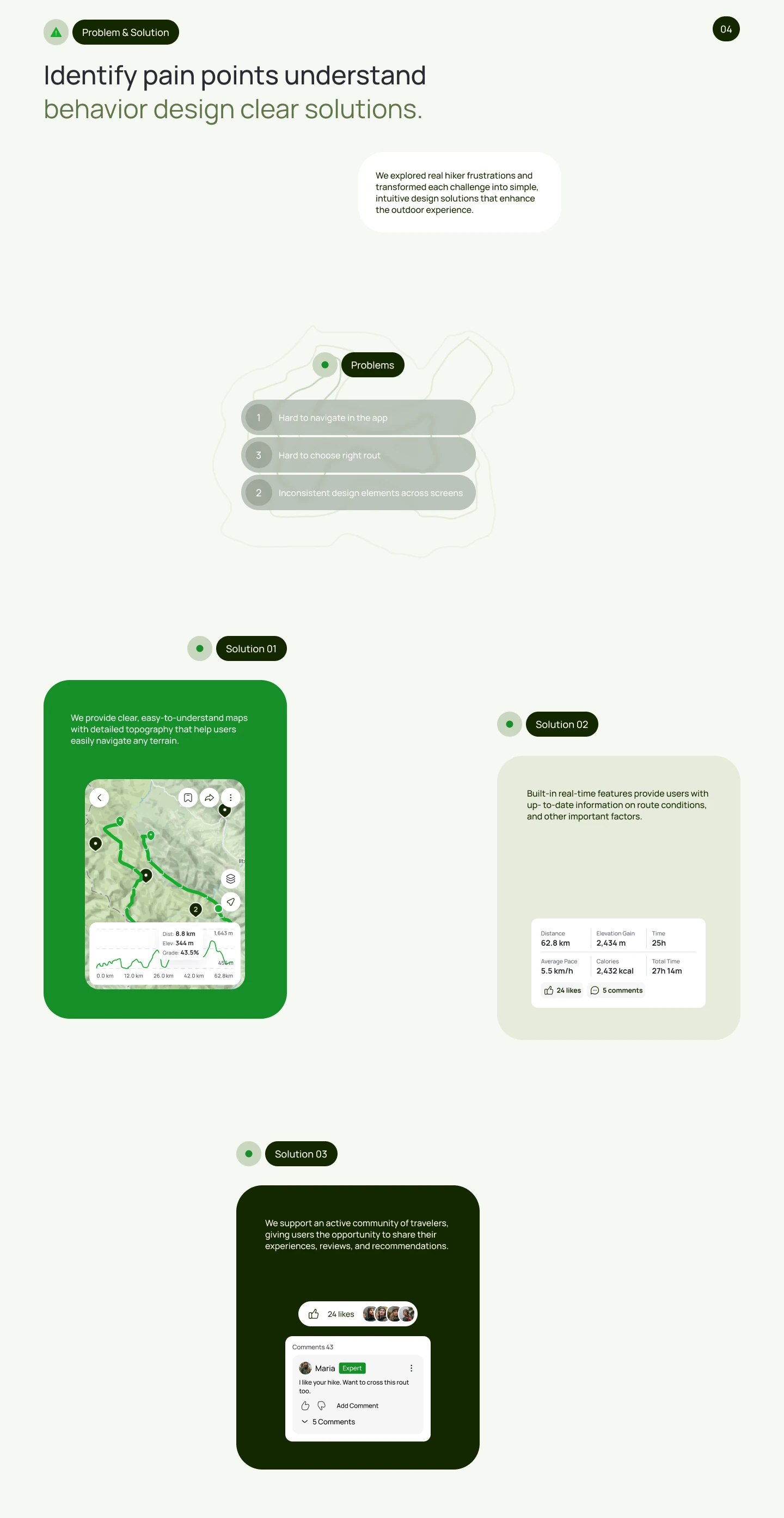
Problem & solutionProblem and solution
The problems in the old product, mapped to solutions.
Problem & solutionProblem and solution
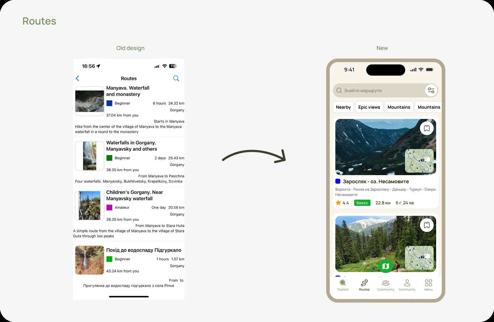
Before → after on the key screens.
03 — Process

Interview, restructure, systematize.

Discovery & interviews

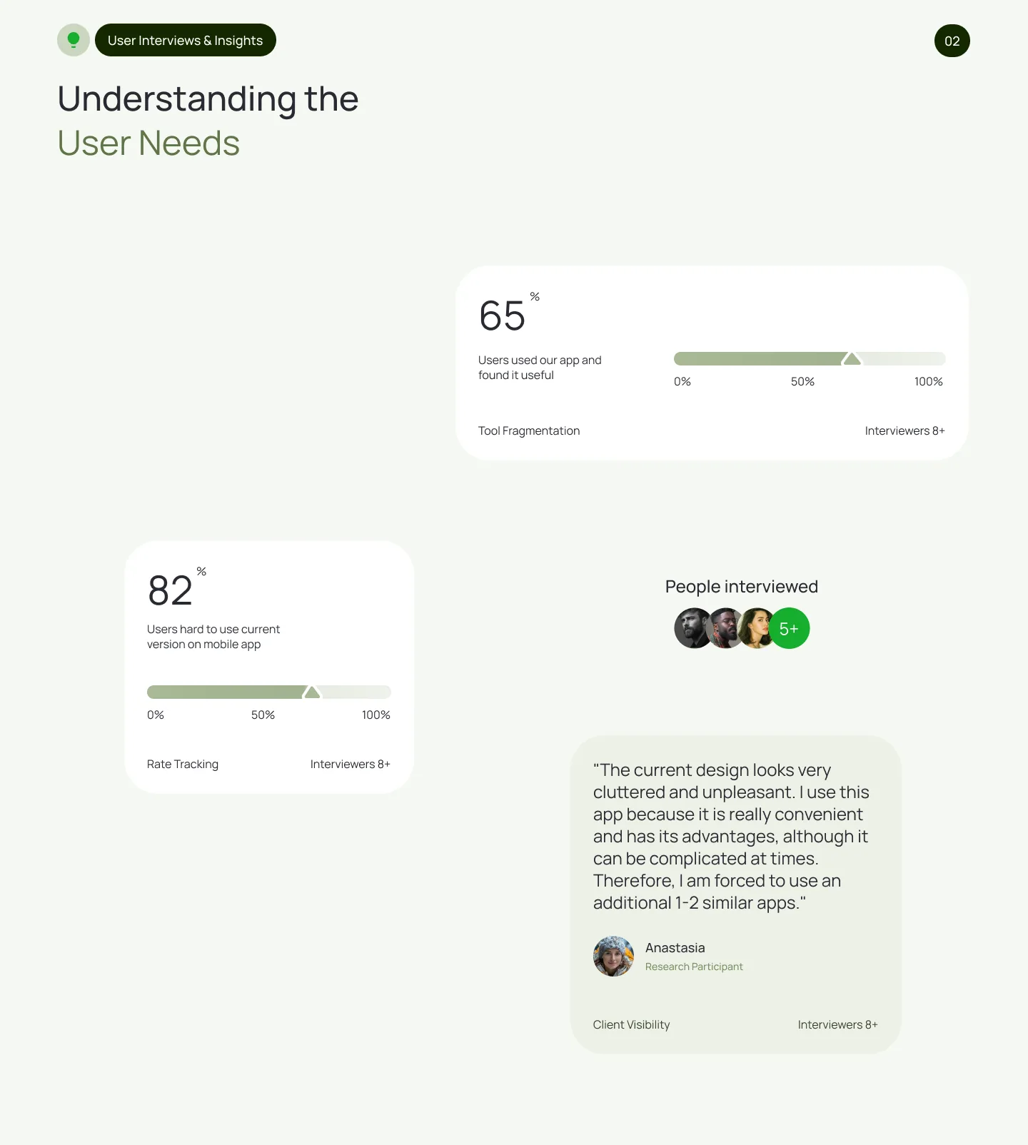
I ran user interviews with hikers to understand how they choose routes, track hikes and share experiences. The insights shaped a new information architecture.

Restructured navigation

Simplified the paths to the core action — finding a route — and grouped community, activities and posts into one coherent environment with filtering.

Design system

Built a reusable system (typography, color, components) so new designs ship quickly and stay consistent, and engineers can assemble screens without losing intent.
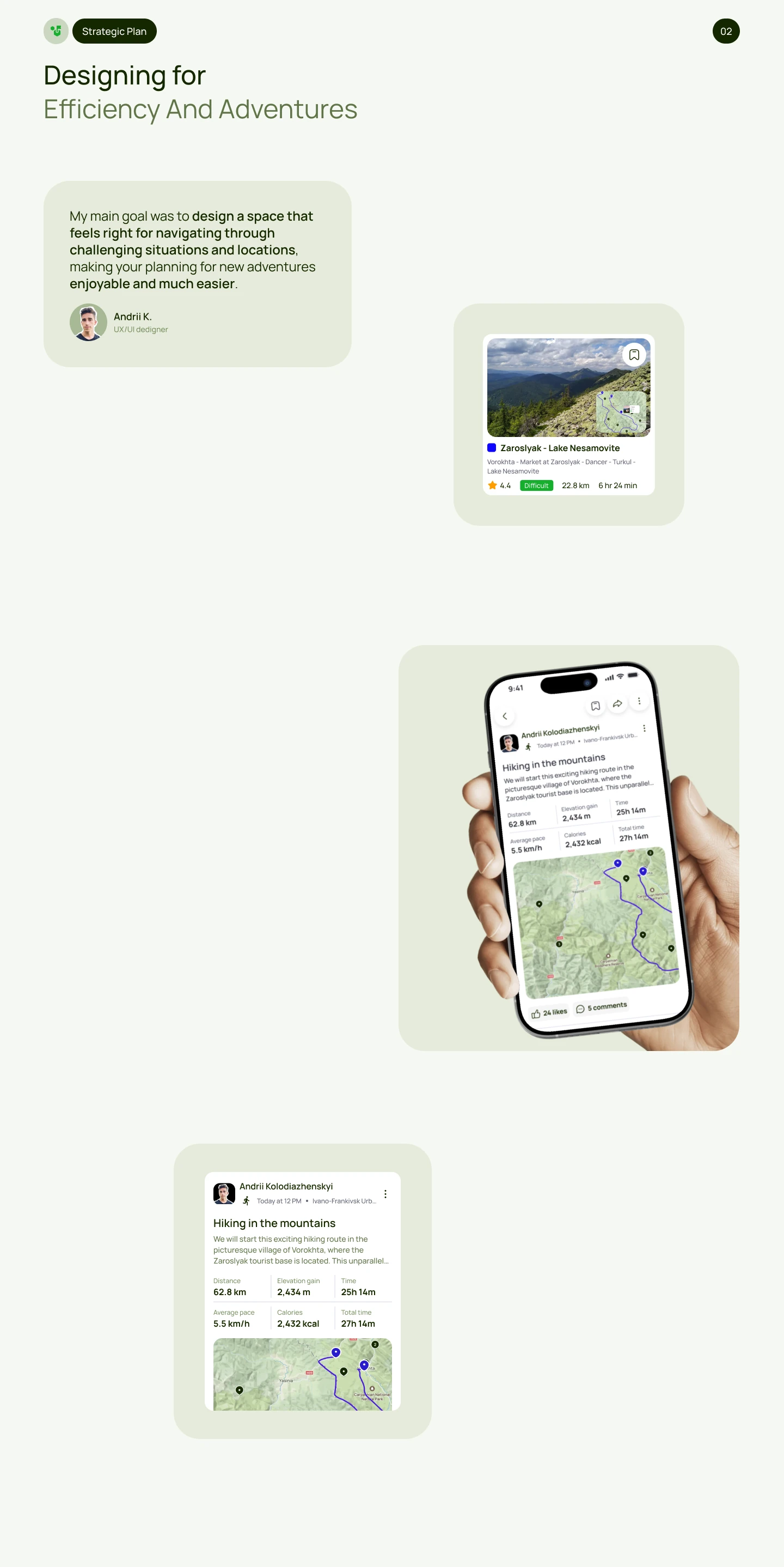
Strategic planStrategic plan
The strategic plan that framed the whole redesign.
Research & insightsResearch and insights
User interviews and the insights that drove the redesign.
Research & insightsResearch and insights
Interview findings turned into a new information architecture.
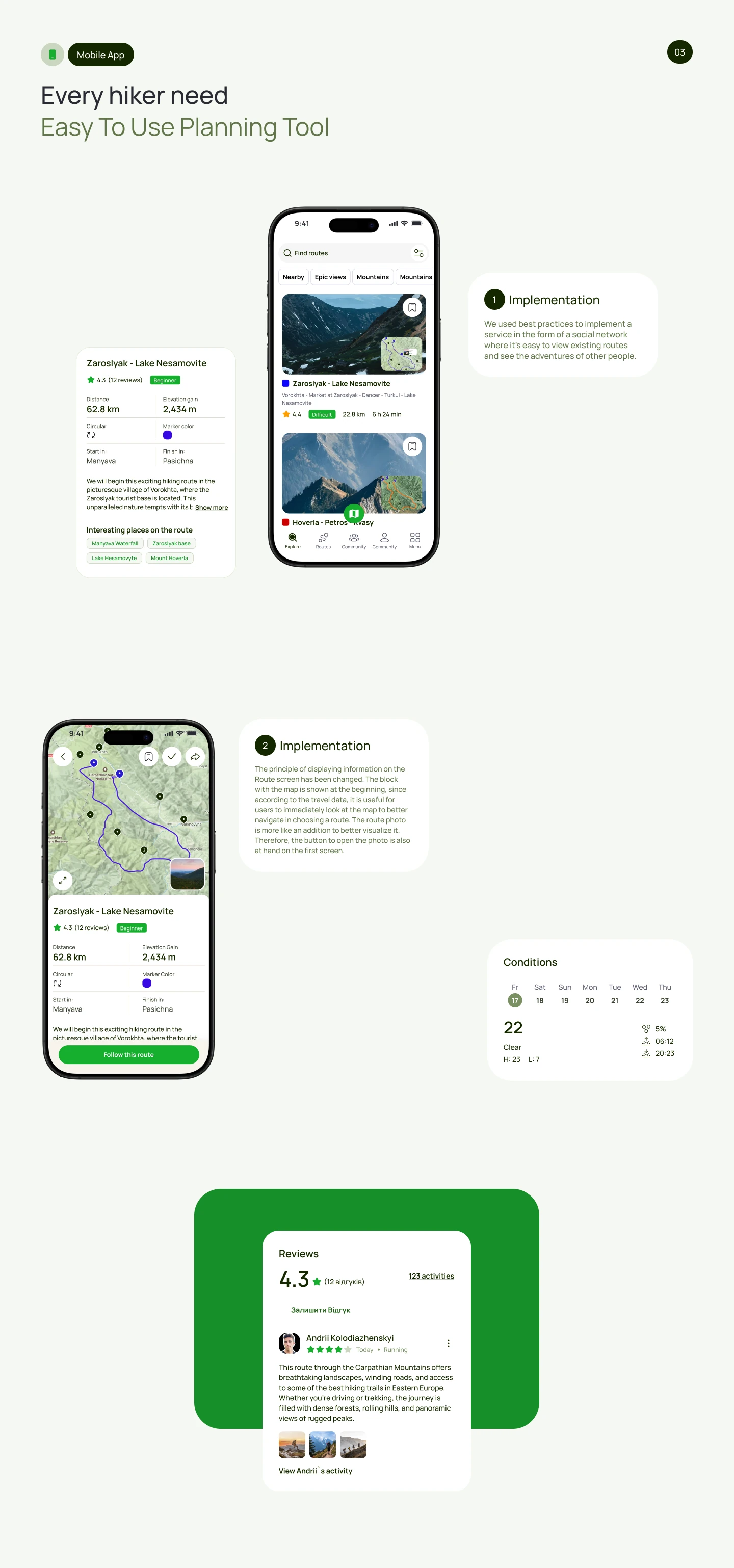
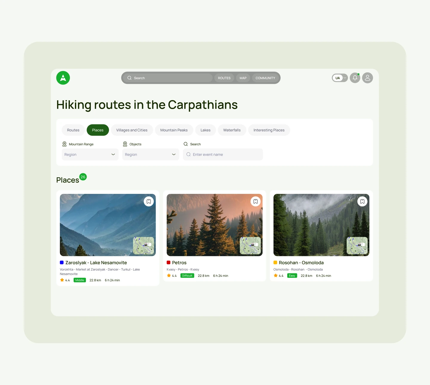
RoutesRoutes
Route browsing — the core screen of the product.
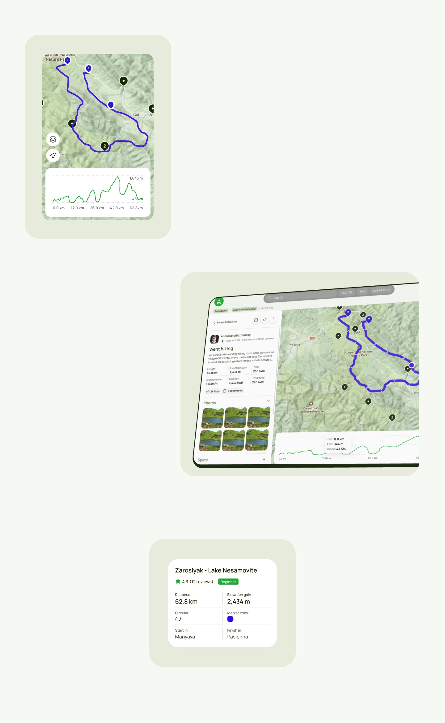
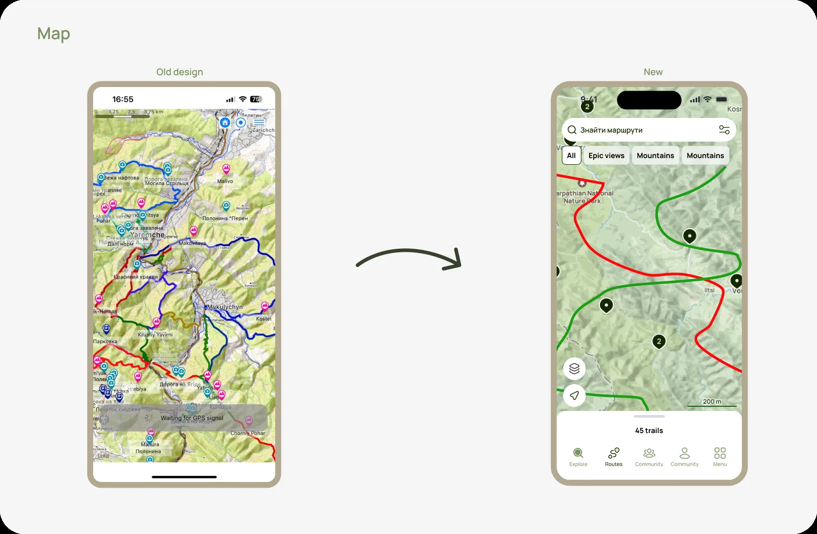
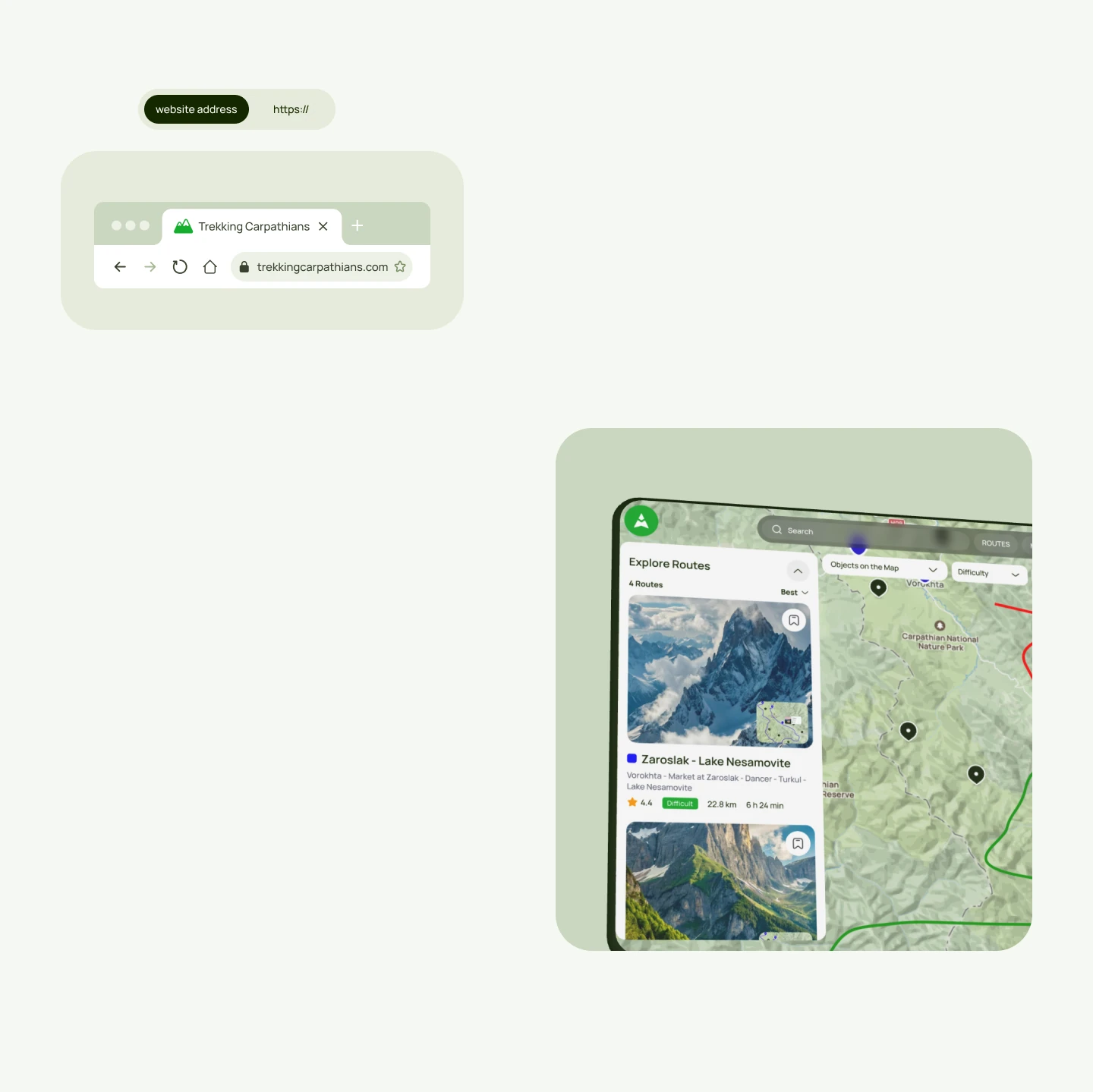
MapMap
The map view for exploring trails by area.
04 — Key decisions

Three calls that shaped the redesign.

Decision 01

Put the route first

Everything else — community, activities, tracking — supports the core job of finding and understanding a route. I cut steps and noise around it.

Simplified navigation let users find the right route up to 3× faster.
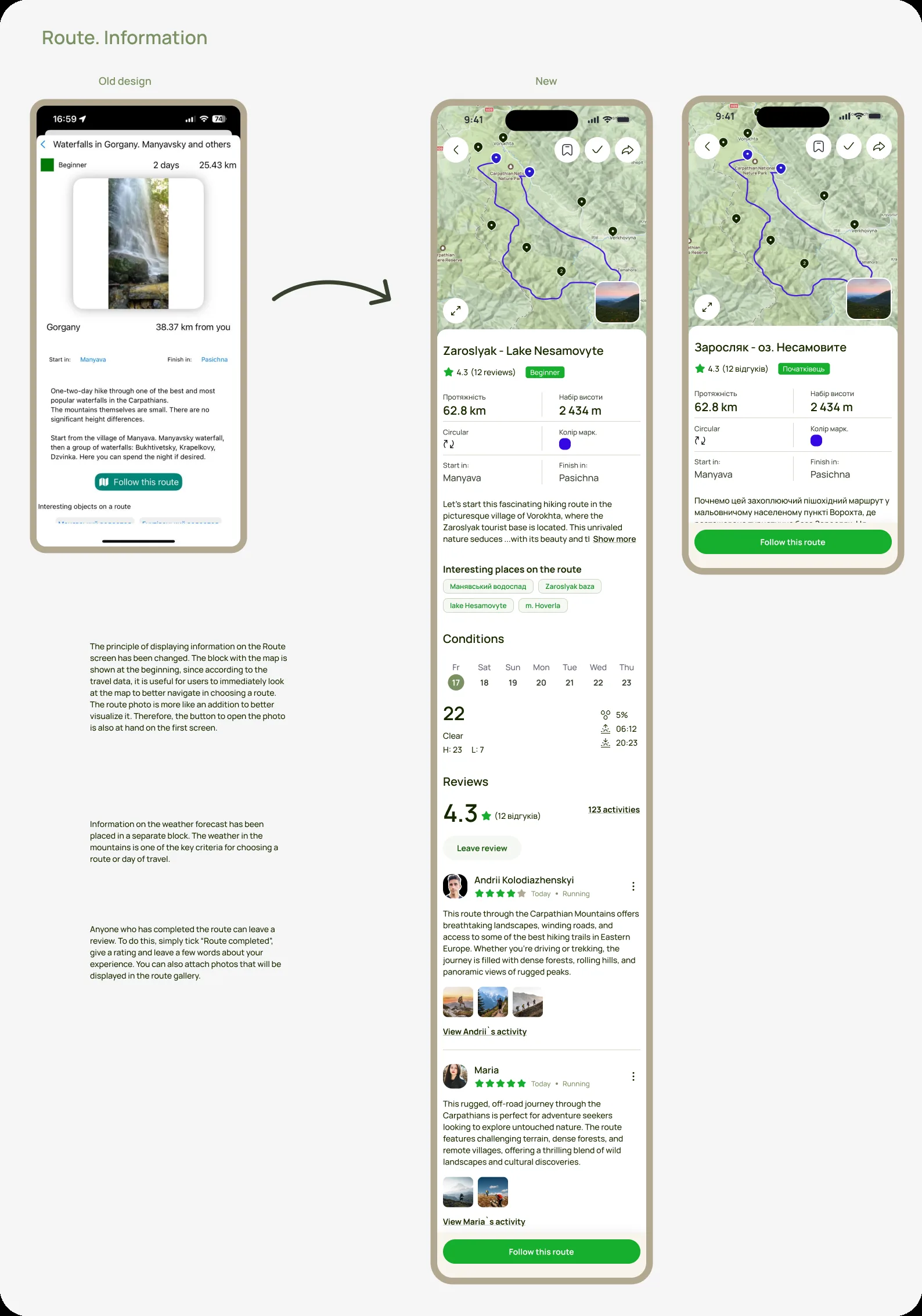
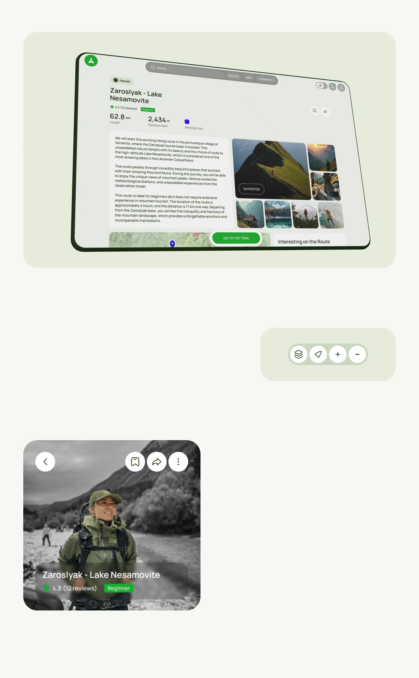
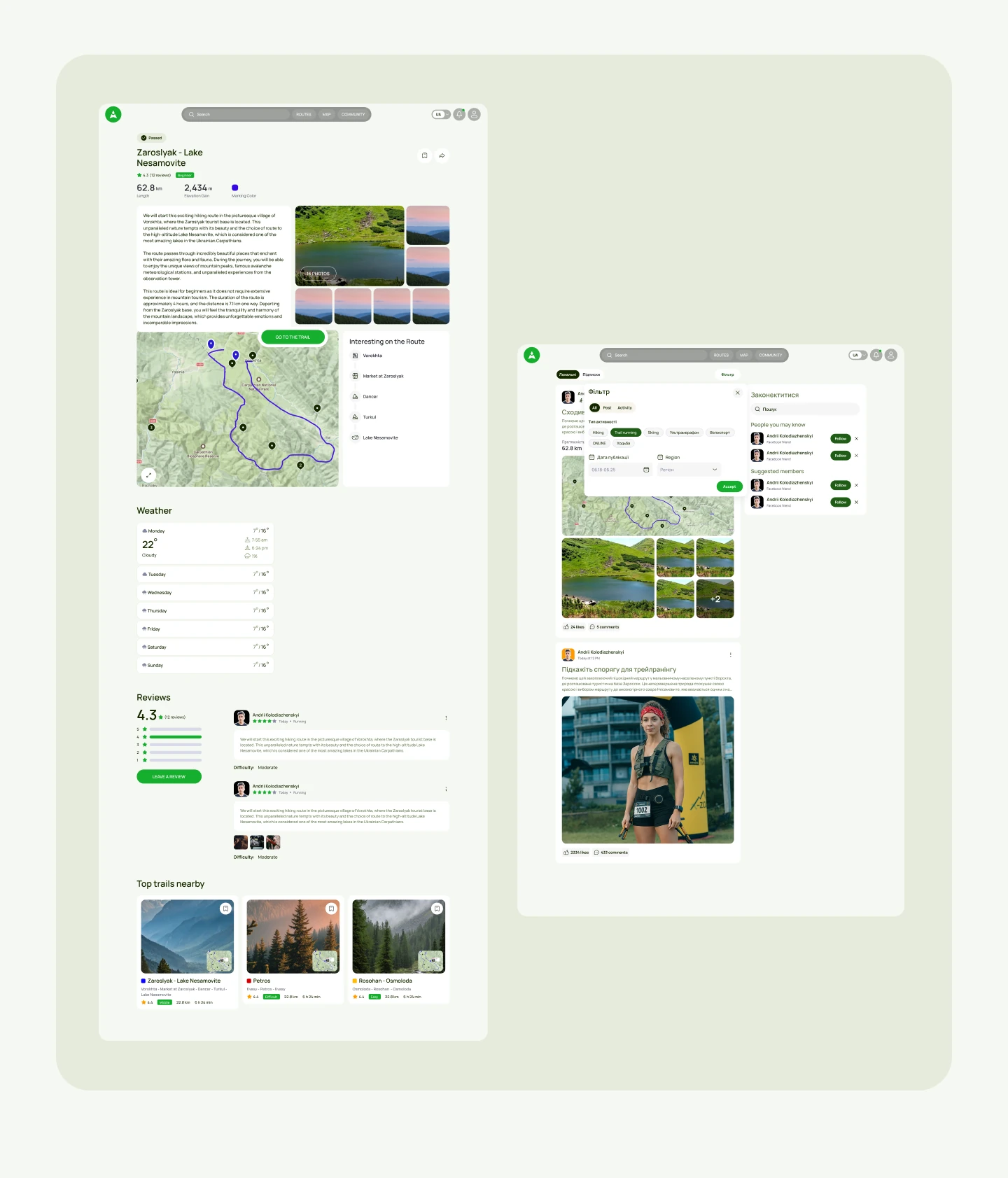
Route detailRoute detail
Route detail — all the info a traveler needs.
Mobile appMobile app screens
The redesigned mobile app — core flows end to end.
Mobile appMobile app screens
Secondary flows: tracking, profile and progress.
Decision 02

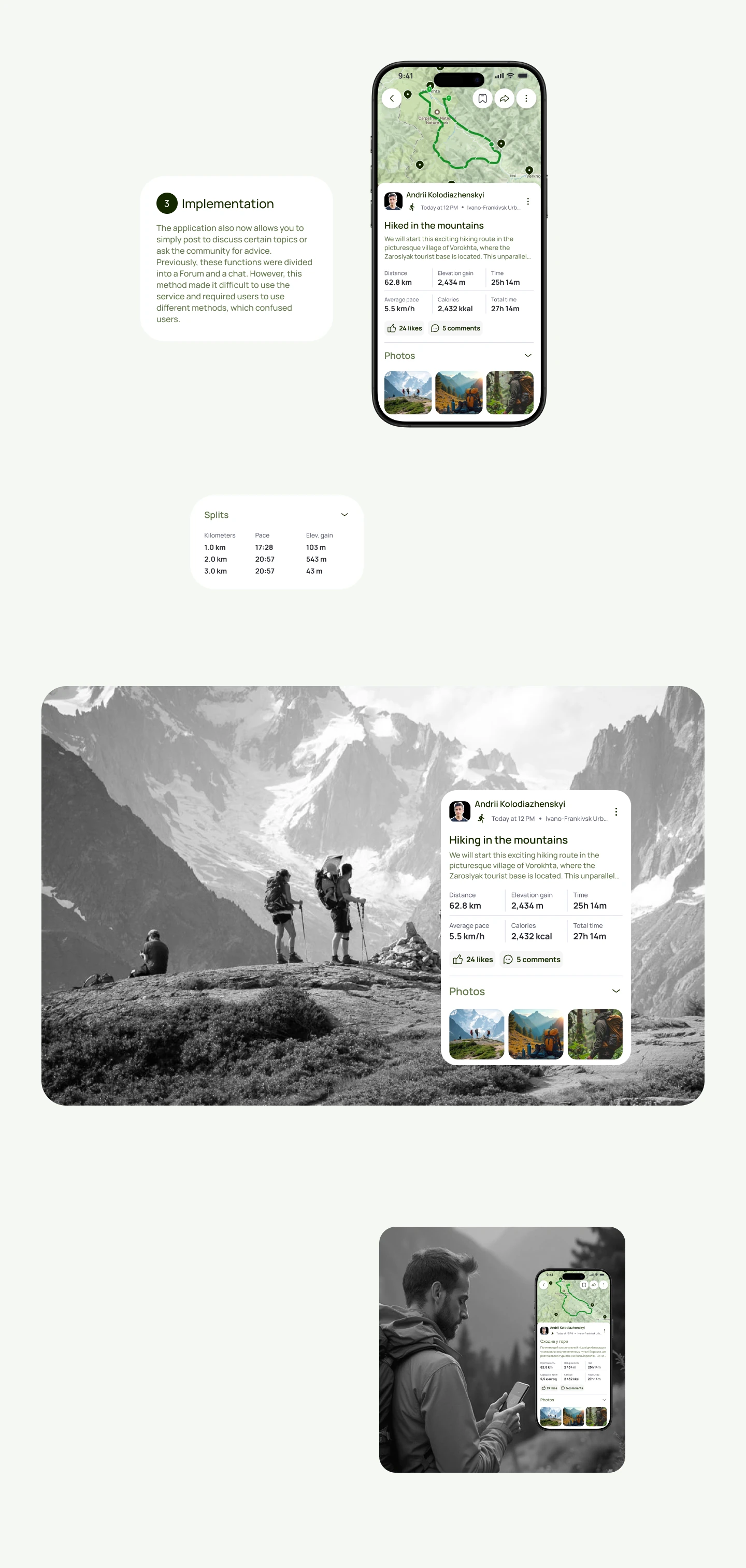
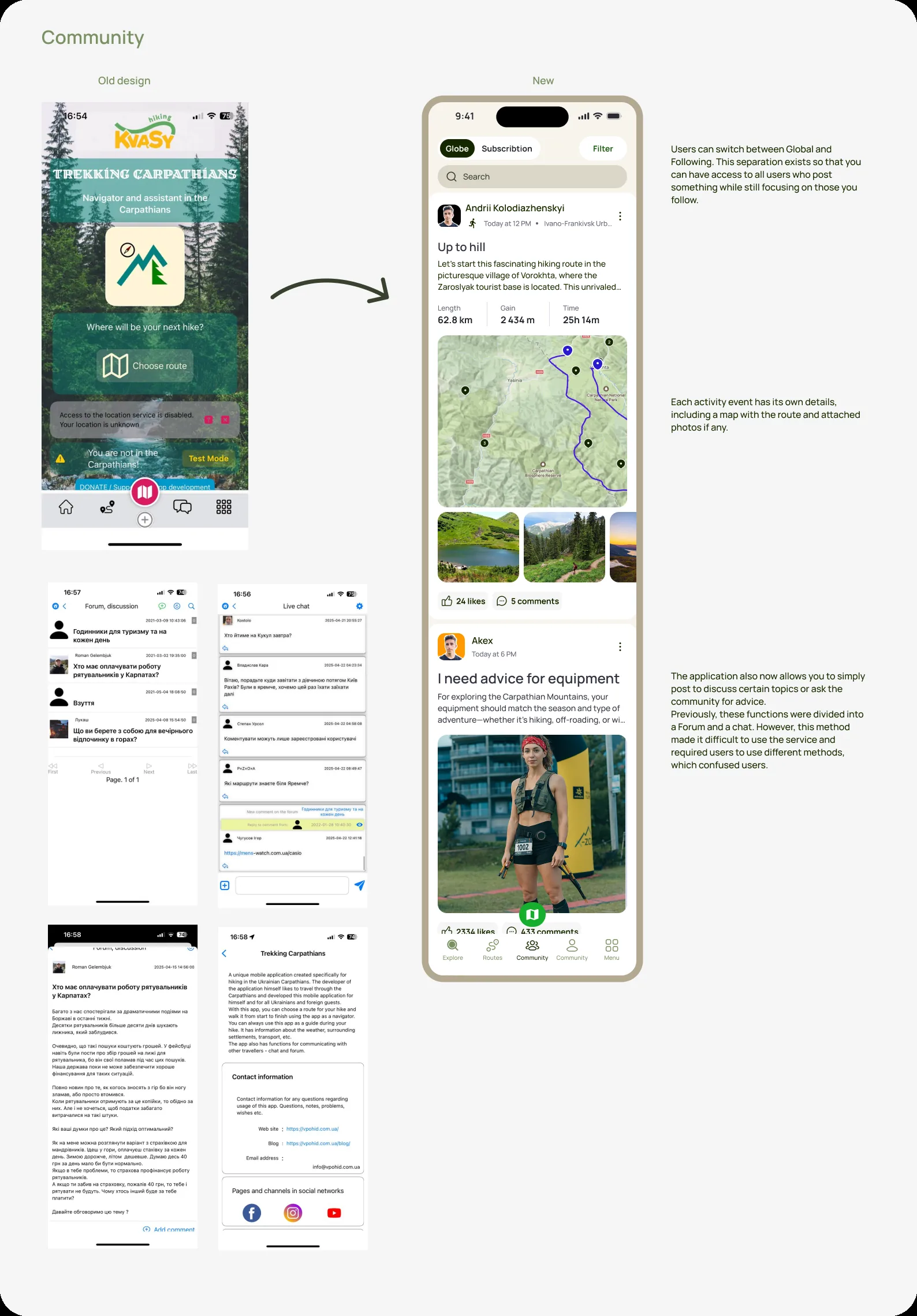
One community environment

Community, activities and posts now live together with filtering, so travelers find relevant answers in the same place they plan and log hikes.
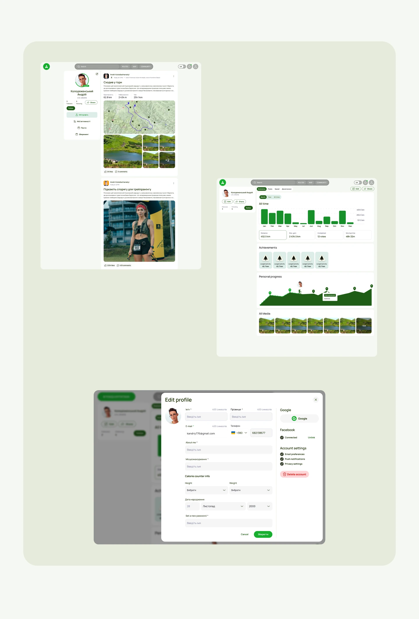
CommunityCommunity
Community — posts, answers and filtering in one place.
ActivityActivity
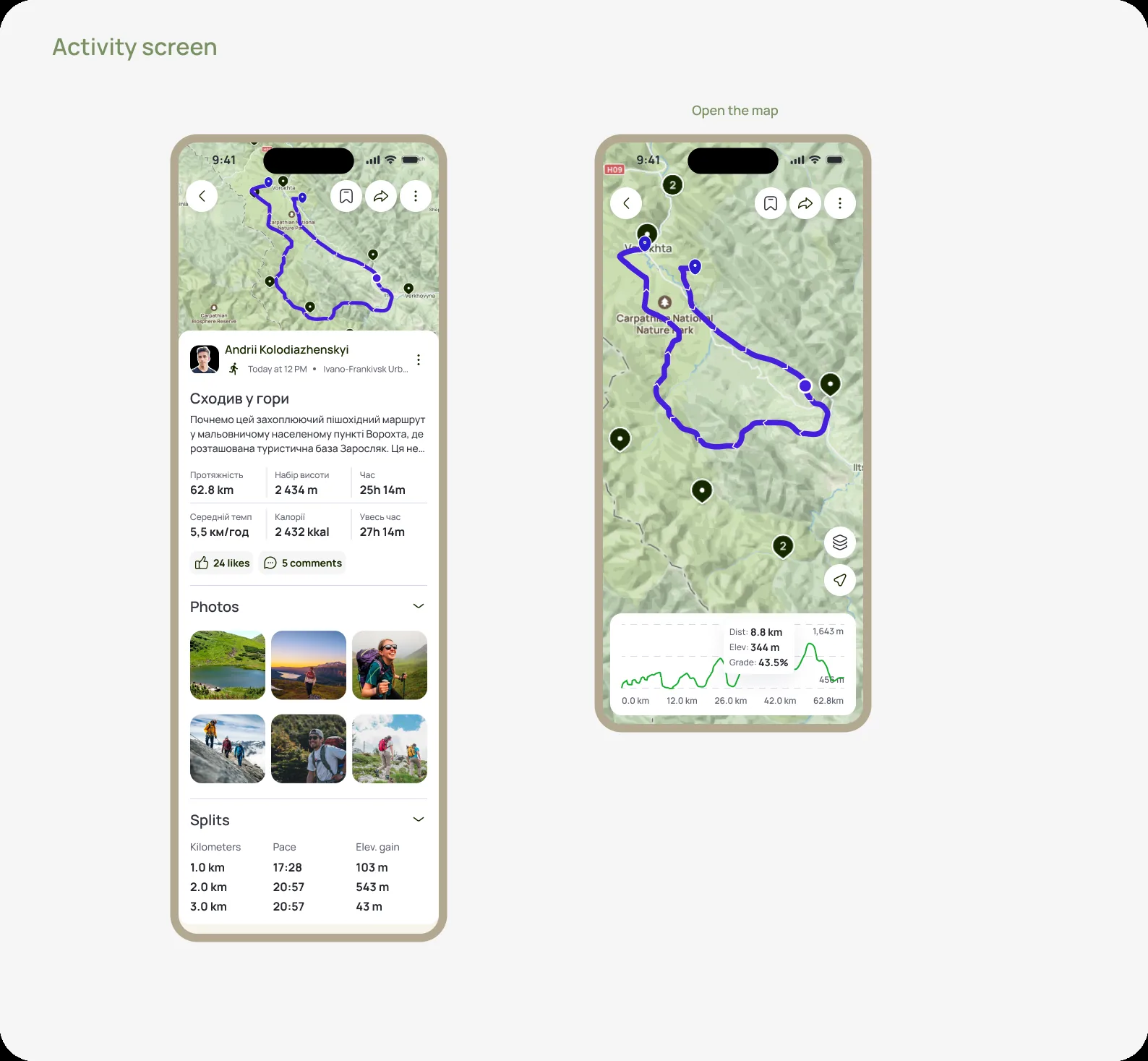
Activity screen — logged hikes and progress.
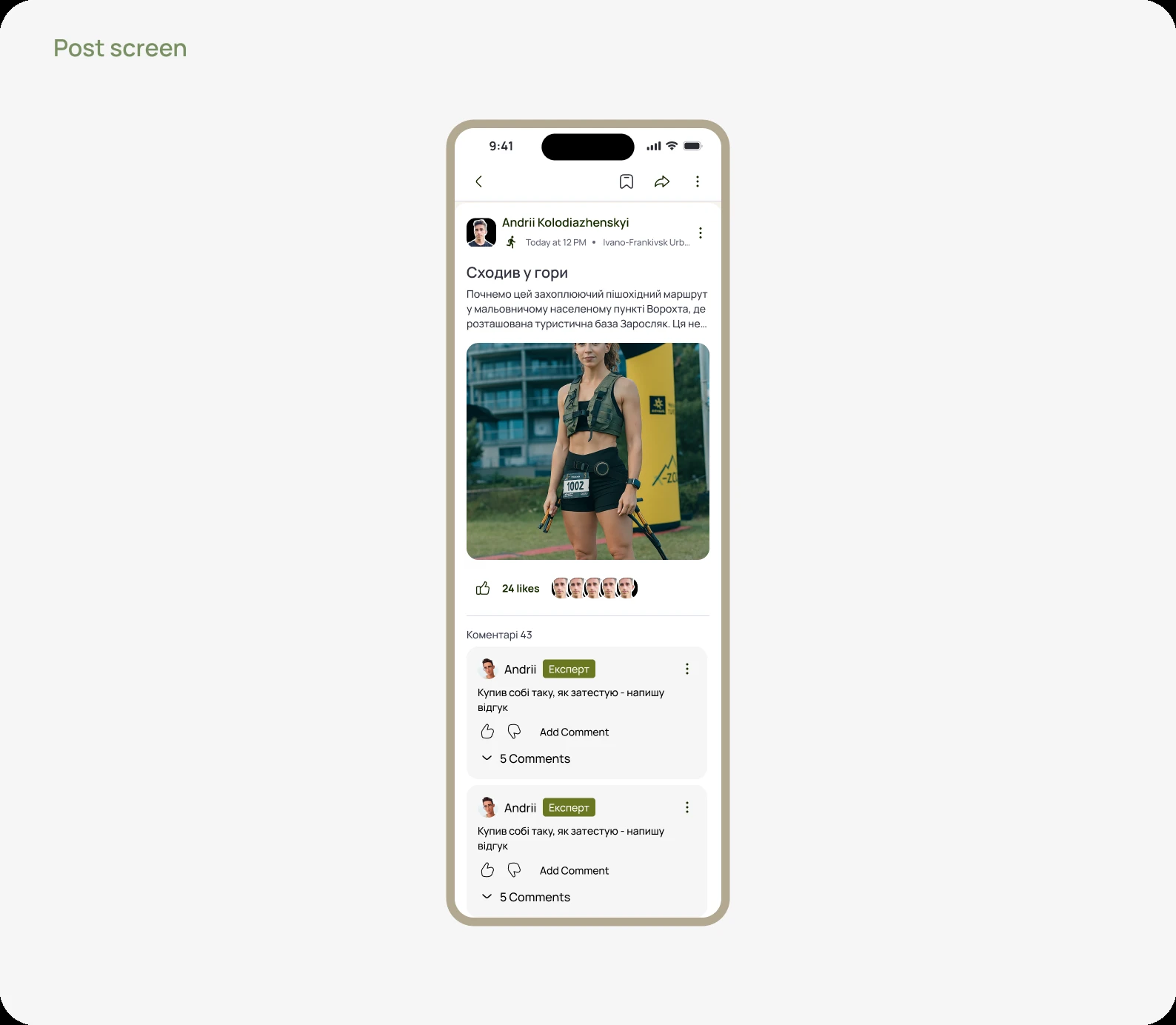
PostPost screen
A single post — how travelers share an experience.
Decision 03

A system, not one-off screens

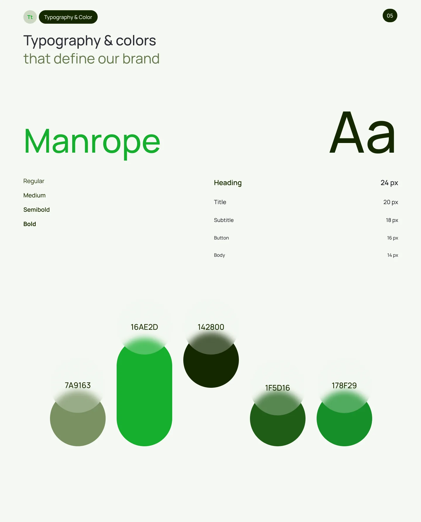
A custom design system kept the visual language consistent and sped up delivery across both the app and the companion website.
Typography & colorTypography and color
Design-system foundations — typography and color.
WebsiteWebsite
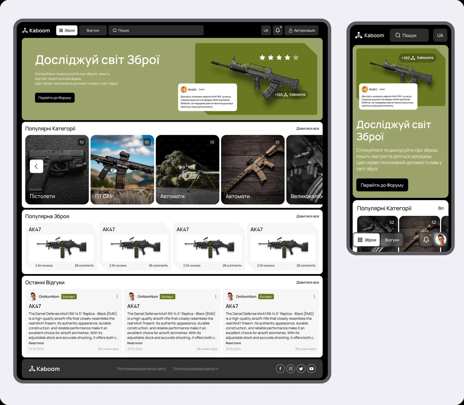
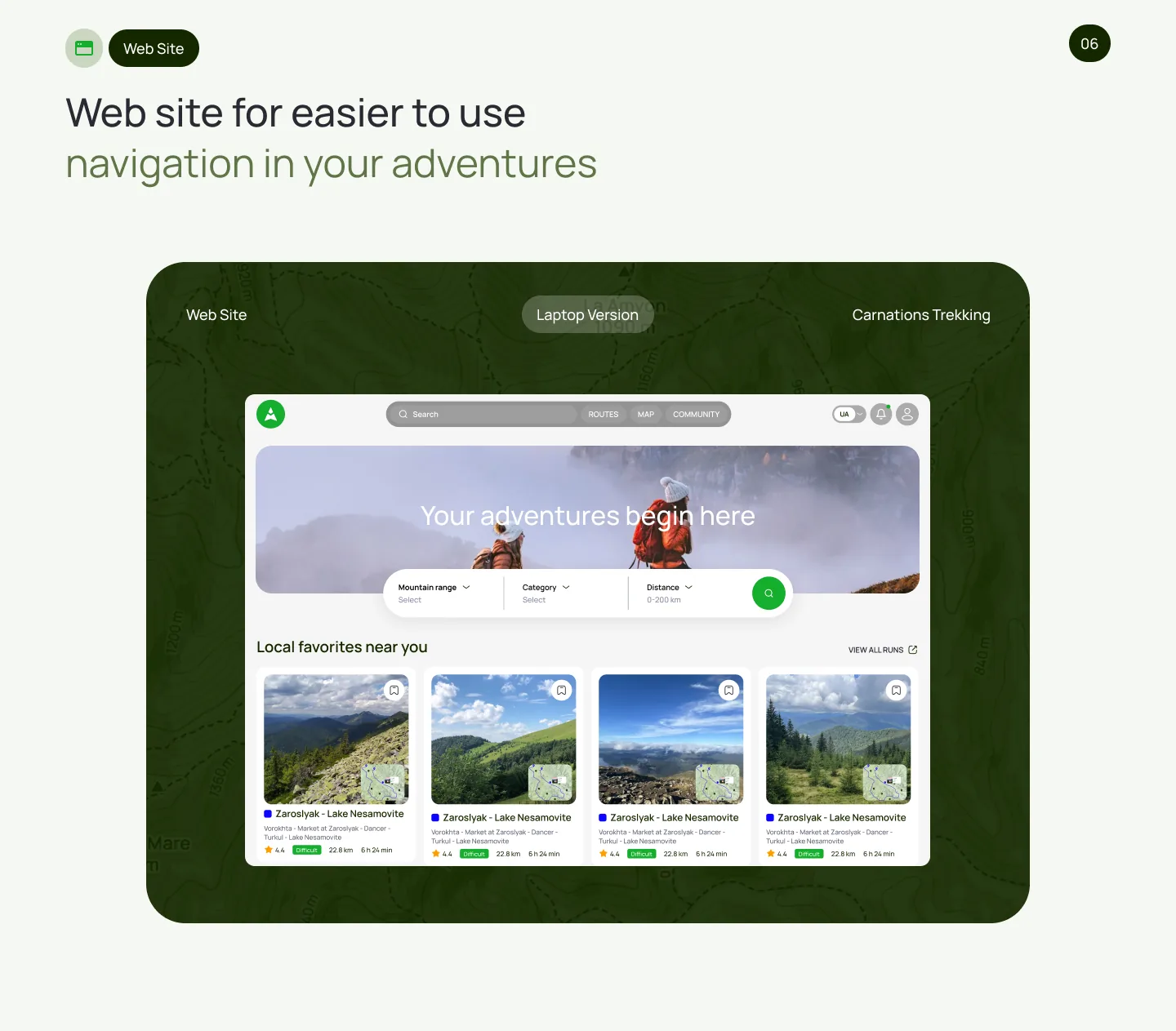
The companion website — hero and first screen.
WebsiteWebsite
Routes on the web, with the same visual language.
WebsiteWebsite
Content sections built from system components.
WebsiteWebsite
Community and stories on the web.
WebsiteWebsite
Closing sections and calls to action.
05 — Outcome

Clearer, faster, more consistent.

Users find the desired route up to 3× faster thanks to simplified navigation.

Community and activities unified into one filterable environment — relevant answers are easier to find.

A reusable design system that speeds up future development and keeps the UI consistent.

A companion website extends the product to the web.
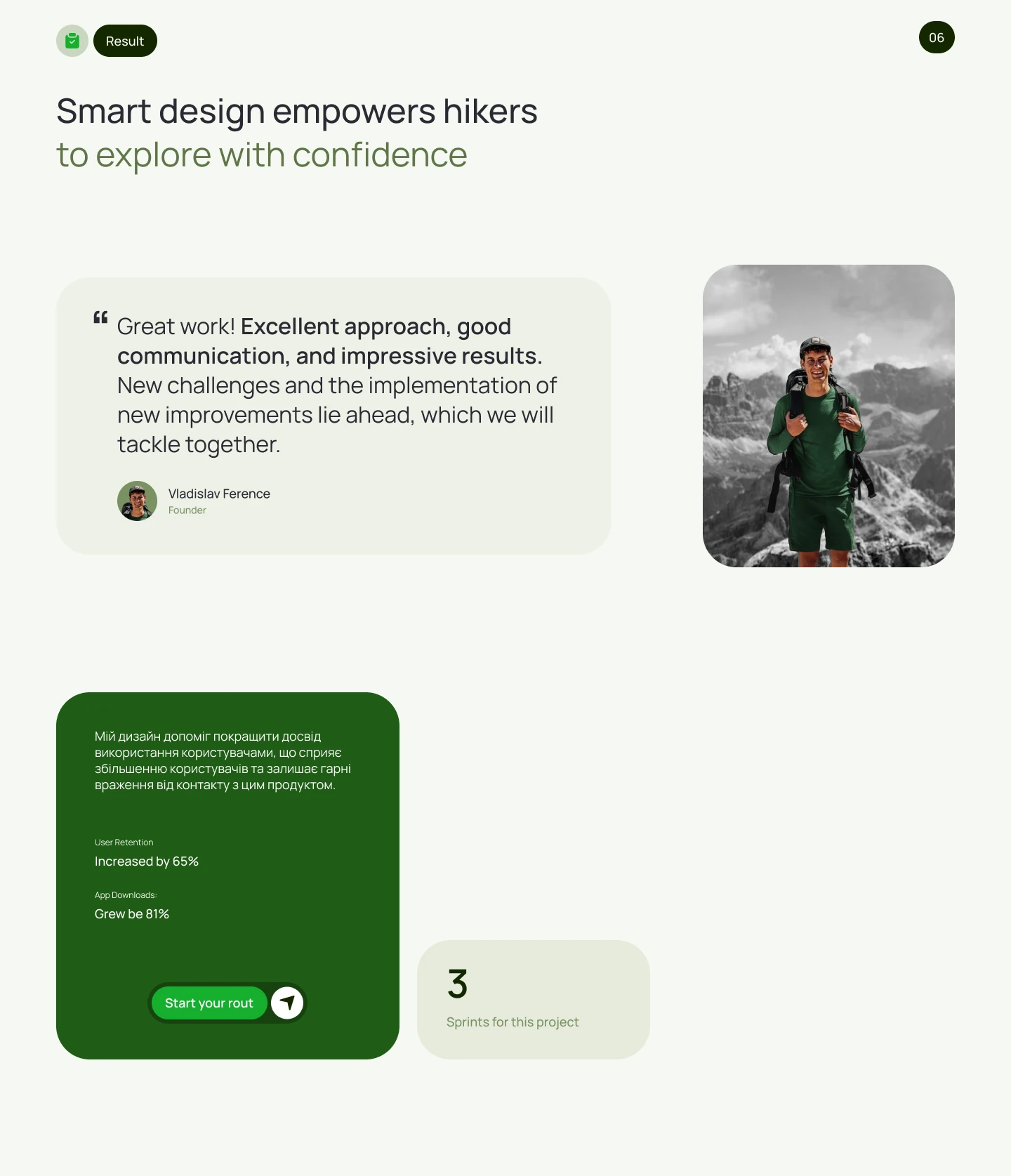
ResultResult
The result — before and after, side by side.
FinalFinal
Final visual of the redesigned product.
Takeaway

From a cluttered app to a clear trail companion.

The redesign proved that in a feature-rich product, structure and a shared system move the numbers more than piling on features.