A mobile app that helps tourists call rescuers in emergencies during mountain hikes.
The core job — reach help — made fast, clear and reliable, even under stress.
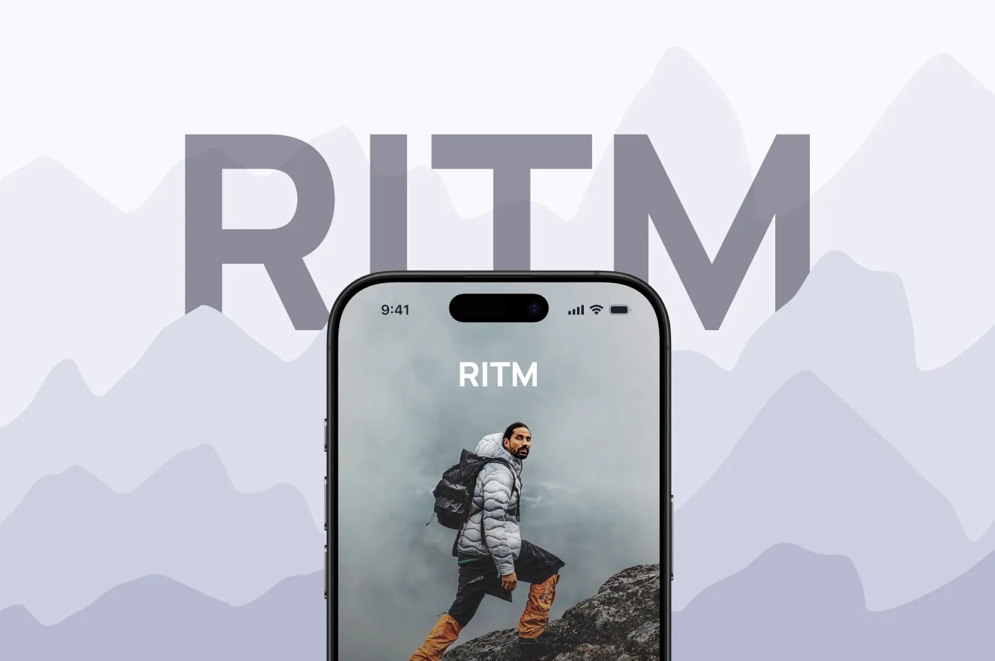
RITM assists tourists during mountain hikes; its main functionality is to call rescuers. That means designing for stress, cold and urgency — not a calm demo.
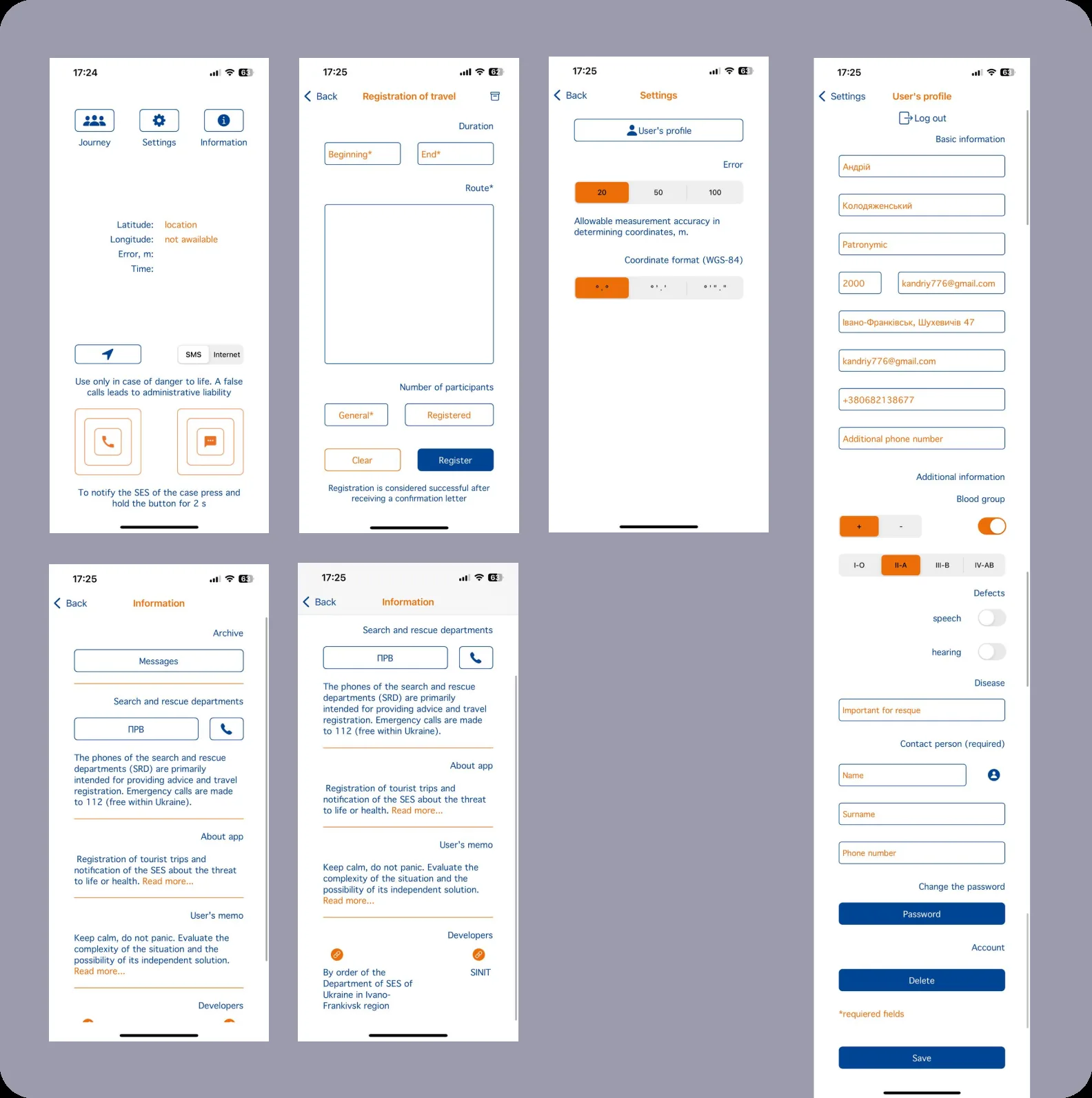
The old design worked against the moment it was built for.
Weak hierarchy made the app hard to perceive and slowed the target action.
Scattered features got in the way exactly when speed matters most.
Calling rescuers had to be unmistakable and fast.
The main screen was completely redesigned. Calling rescuers is now three easy steps: press call, choose a method of communication, report the situation.
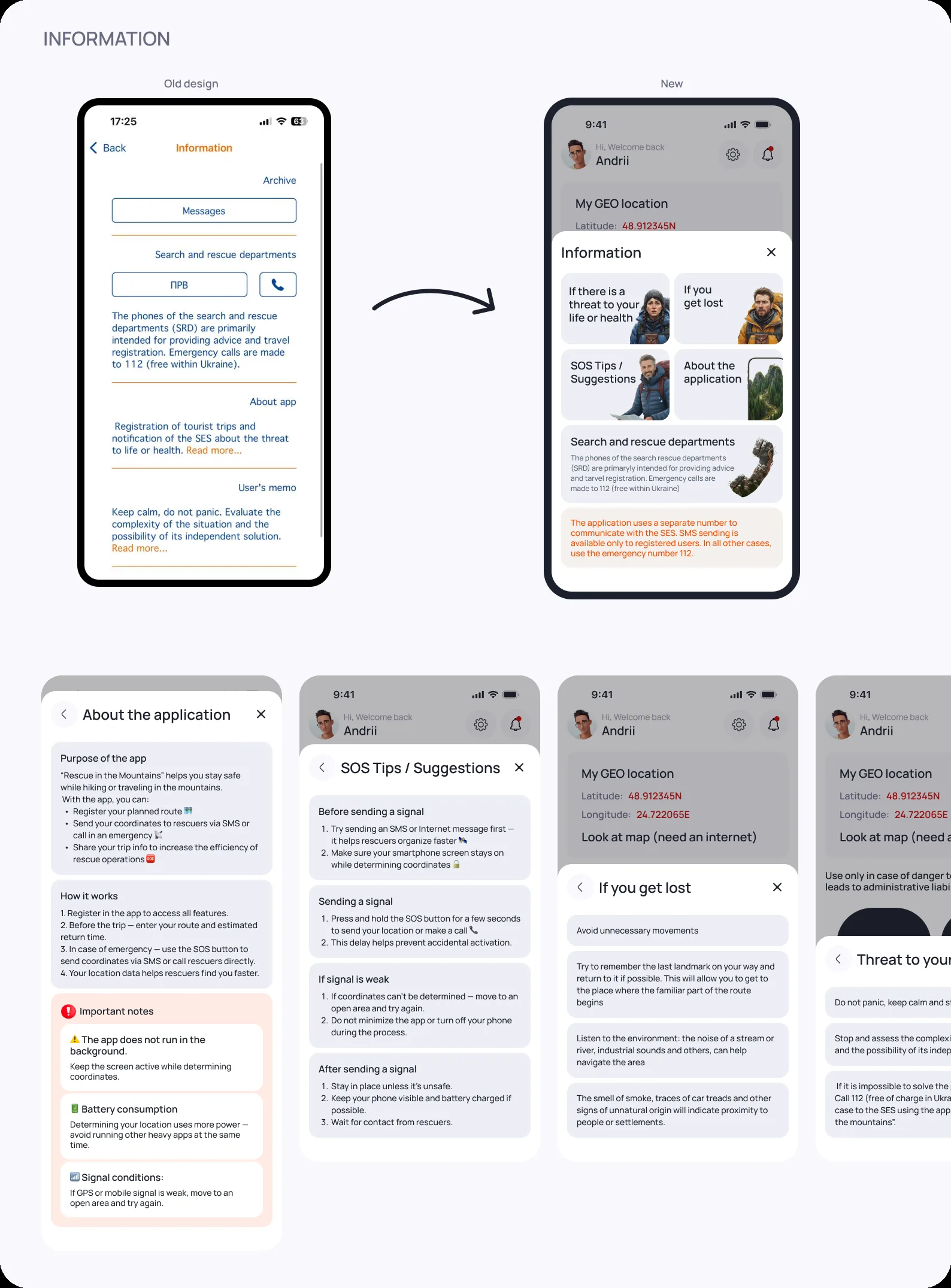
Added a “View SOS Tips” button for quick guidance, moved navigation to the bottom, and placed a “View Map” action for when the internet is available.
Simplified the flows while adding new functionality, so the app is faster to use and harder to get wrong.
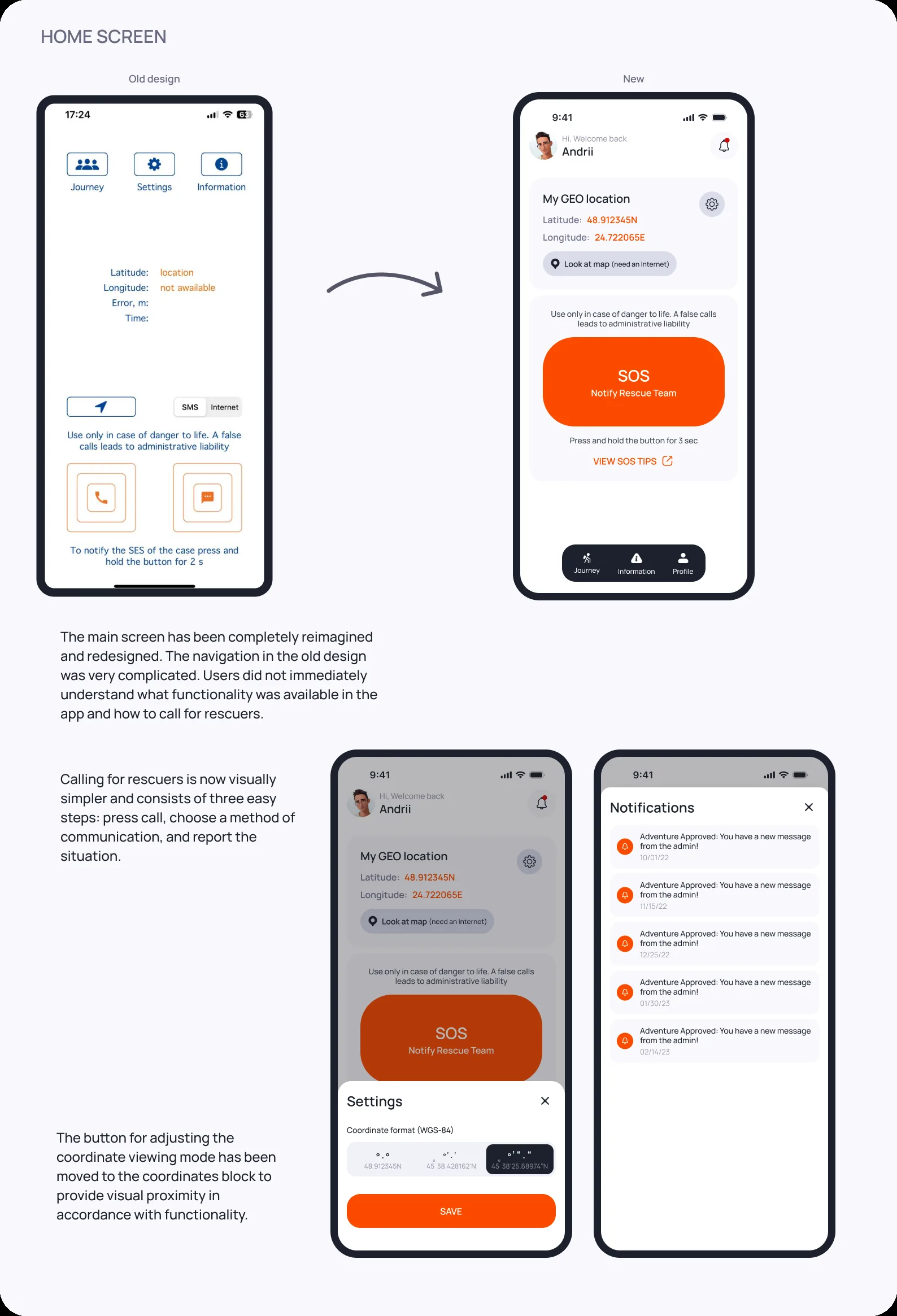
Call → choose communication → report. Big touch targets, high contrast, and no navigation to think about in the moment.
Usage errors dropped by 5× after the redesign.
SOS tips and a map action are one tap away, so users get help and orientation without hunting through menus.
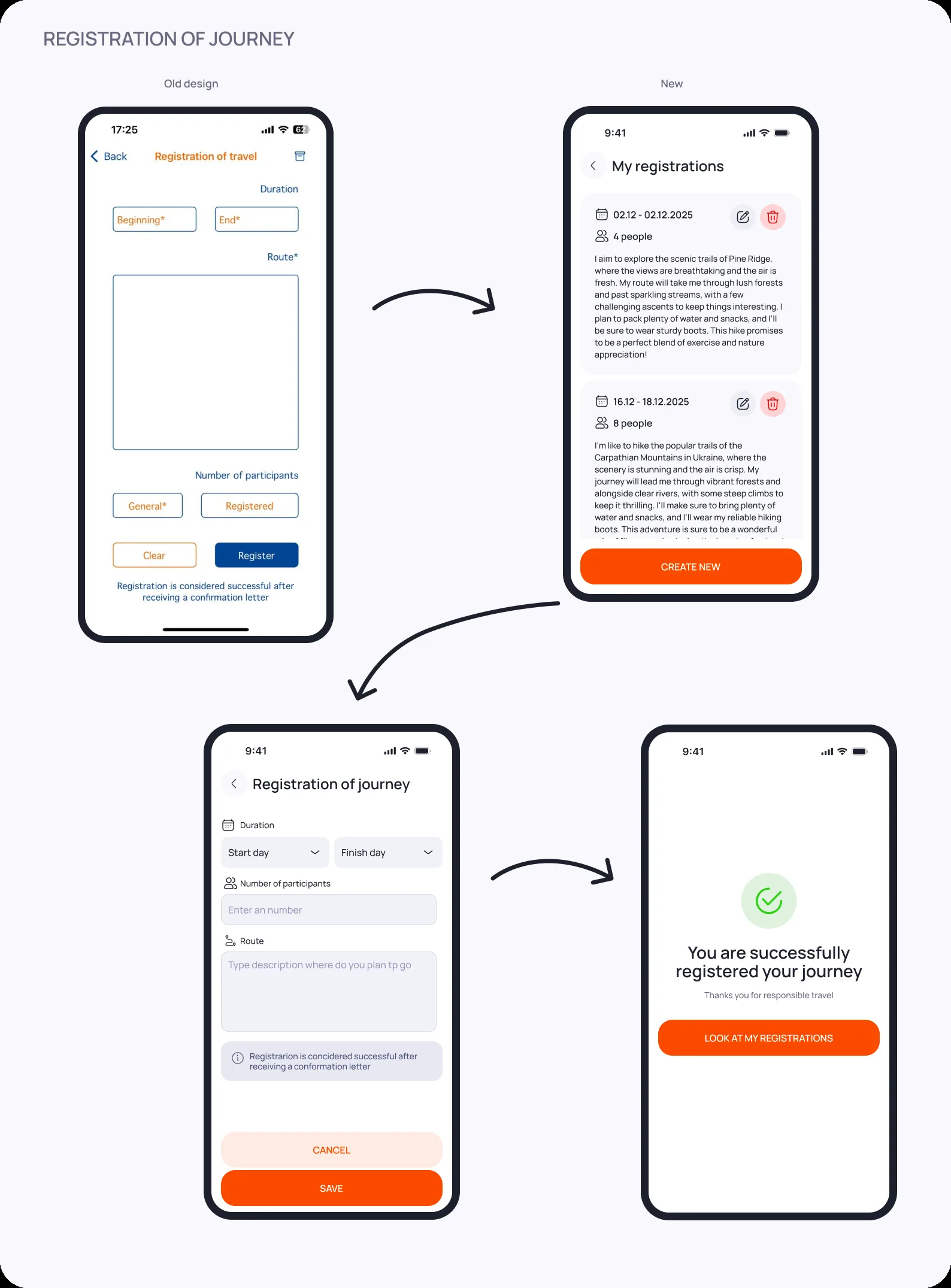
Users navigate the interface faster and usage errors dropped 5×.
The updated design increased loyalty, reduced uninstalls and increased downloads.
Cutting the core action to three unmistakable steps made the product measurably safer and more trusted.