A pre-launch landing page for Pitwhiz — a mobile-first motorsport app that helps racers log setups, track sessions and unlock AI-powered insights.
One job: make a racer understand the product in ten seconds and join the waitlist. Built on a dark, track-side visual language with an acid-yellow accent.
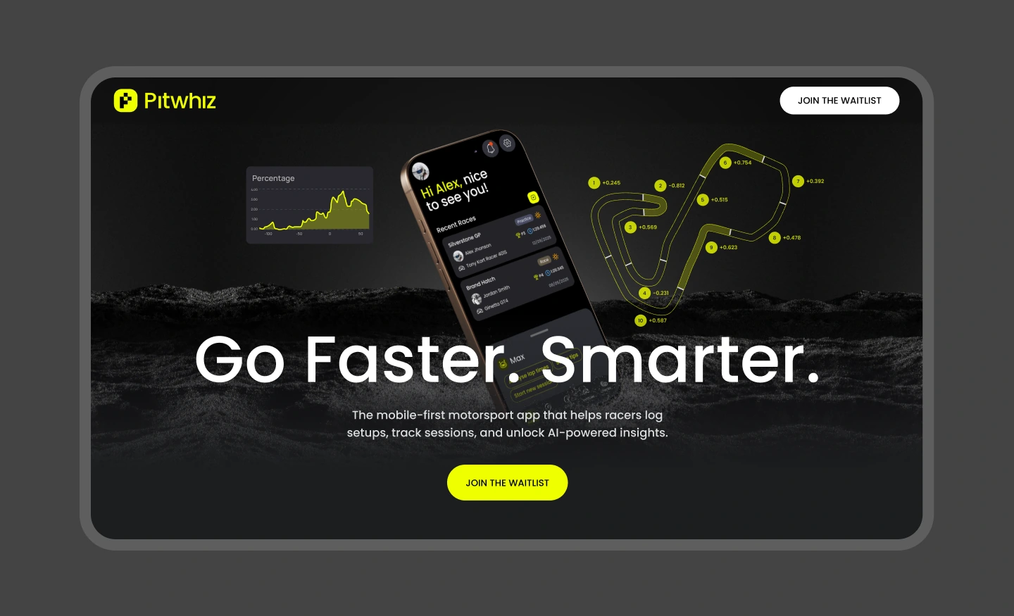
Pitwhiz is a mobile-first app for racers — karting, formula, GT, bikes. It replaces the notebooks and camera rolls where setups, lap times and session notes usually die, and turns them into data a driver can actually act on.
The landing page runs ahead of the product: no downloads yet, just one conversion — join the waitlist. So every section has to earn that click.
Pre-launch means no reviews, no ratings, no downloads — the design has to carry all the credibility.
A racer scrolling on a phone must get "what is this" before the first swipe ends.
Real UI in real context — the product had to be visible, not described.
Track-side photography, dark surfaces and an acid-yellow accent — motorsport, not generic SaaS.
Every block funnels to the same CTA: join the waitlist for early access.
The hero puts three things side by side: a performance chart, the app itself on a tilted phone, and a telemetry-style track map with sector deltas. Before reading a word, you already know this is about data on a racetrack — and the waitlist button is right there.
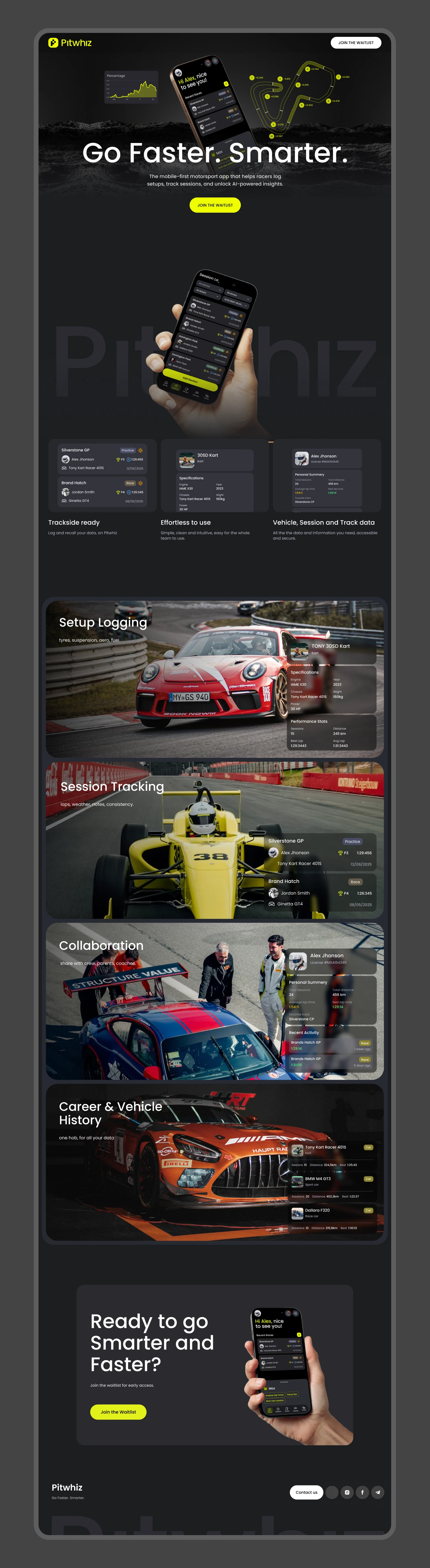
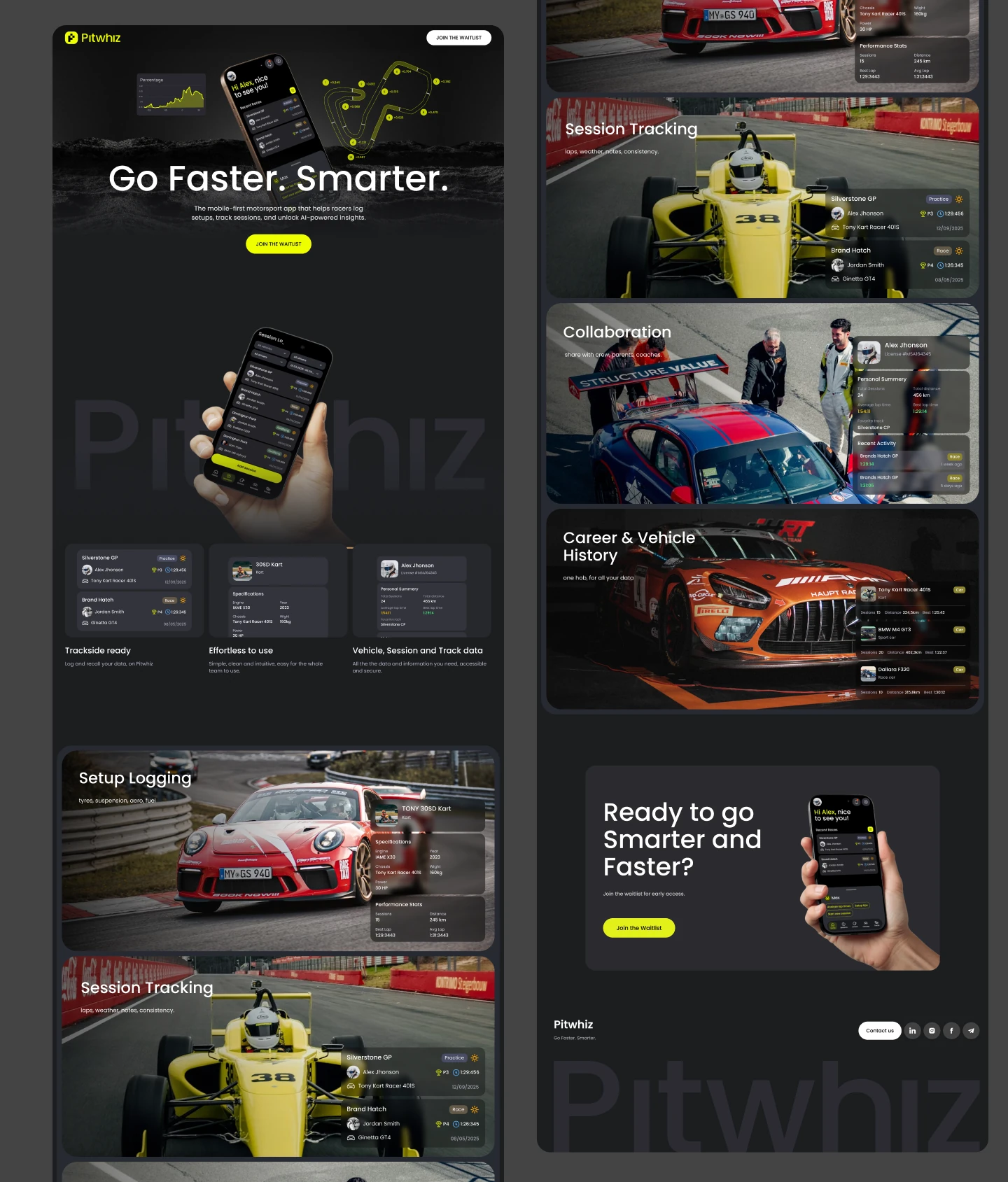
Instead of a feature list, each capability gets its own full-bleed block with real track photography and the matching app UI floating over it: Setup Logging (tyres, suspension, aero, fuel), Session Tracking (laps, weather, notes), Collaboration (share with crew, parents, coaches) and Career & Vehicle History (one hub across seasons).
Above them, three compact cards answer the practical objections — trackside ready, effortless to use, and all your vehicle, session and track data in one secure place.
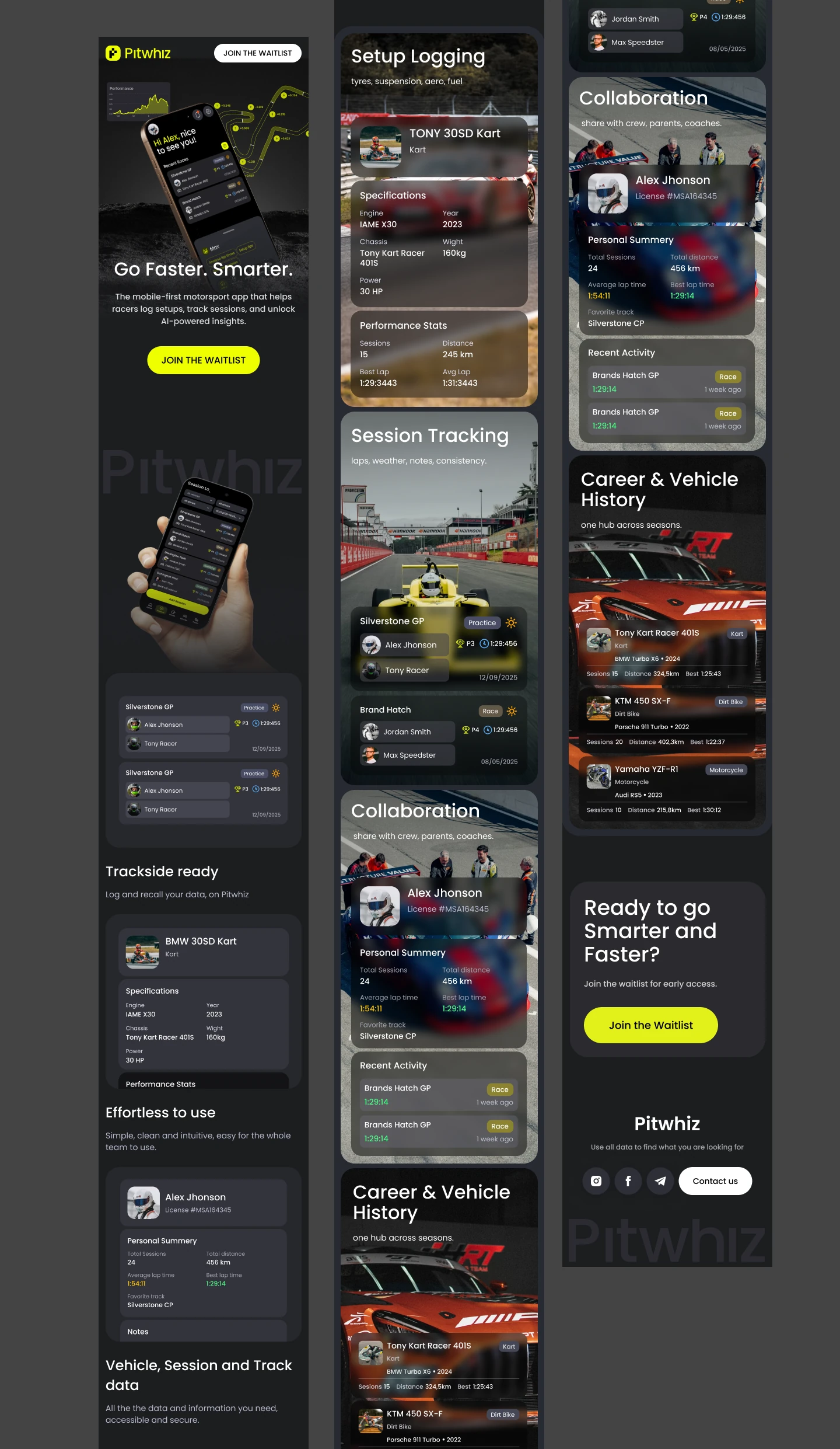
It's an app for people standing in a pit lane with a phone in hand, so mobile is the primary canvas. Feature blocks stack, the app screenshots stay legible, and the waitlist button never leaves thumb reach.
A hero that explains a data product in one screen — chart, app and track map together.
Feature blocks that show the UI in real racing context instead of listing bullet points.
A paddock-native visual language — dark surfaces, acid yellow, track-side photography.
Everything funnels to one action: join the waitlist.
With nothing to download, credibility comes from craft: showing the real interface, in the real environment, with a brand that feels like it already belongs on a starting grid.