A selling landing page for Glow-MI — a personal makeup course by Mariia Ilchyk, a makeup artist with six years behind the brush and Paris and Ukrainian Fashion Week on her CV.
The product isn't a course platform — it's trust. The whole page is built to make a woman believe she can do her own makeup, and to make buying it a two-tap decision.
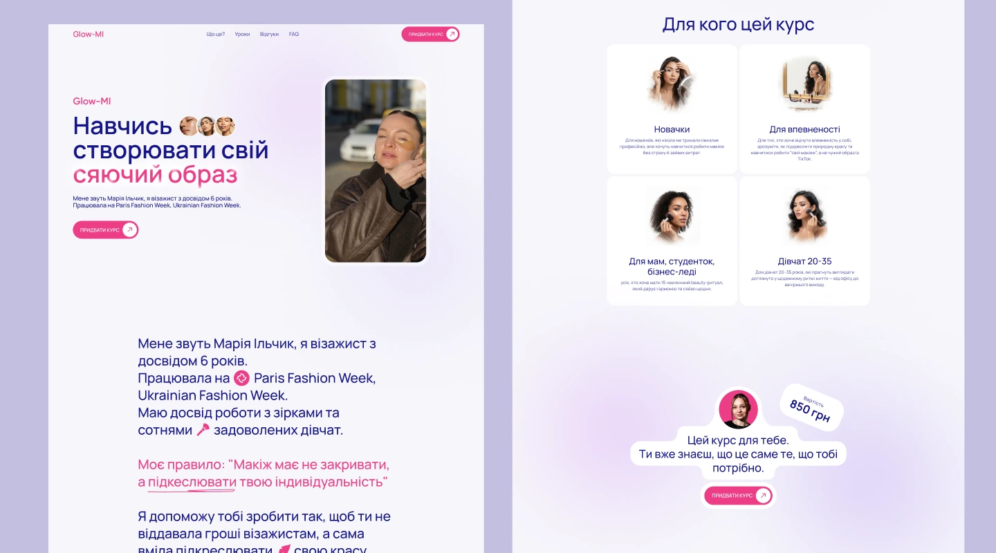
Glow-MI is an author's course — "Makeup for yourself" — built on one promise: you shouldn't have to pay a makeup artist to feel beautiful. The author's rule sets the whole tone: "Makeup shouldn't cover you — it should underline who you are."
So the landing had to carry a personal brand, not a corporate one: her voice, her face, her students' results. Warm pink-and-lilac gradients, soft rounded cards and a friendly, conversational rhythm.
The audience isn't sure the course is for them — the page has to answer that before it asks for money.
A personal course sells on credibility — experience, real clients, real results.
Beginners, mums, students, women 20–35 — each needs to recognise herself on the page.
Before/after is the strongest proof in beauty — it had to be front and centre.
The full course at 850 ₴, or single lessons at 300 ₴ — without confusing the offer.
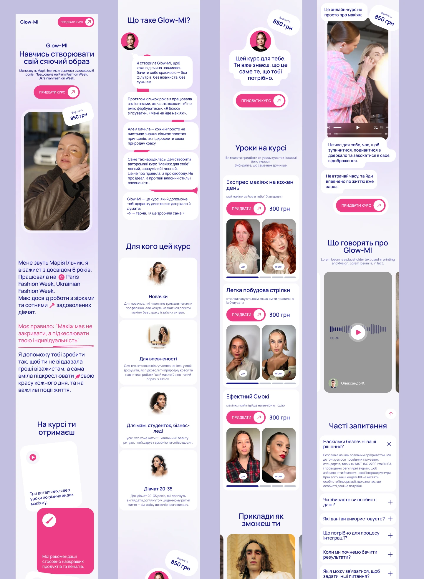
Instead of a dry "about the author", the story runs as a chat conversation — the way she'd actually explain it to a friend. It carries the origin of Glow-MI and lands on the emotional payoff: "I'm beautiful. And I did it myself."
Right after, four audience cards let every visitor find herself — beginners, women who want confidence, mums and students, women 20–35 — followed by what's actually inside the course.
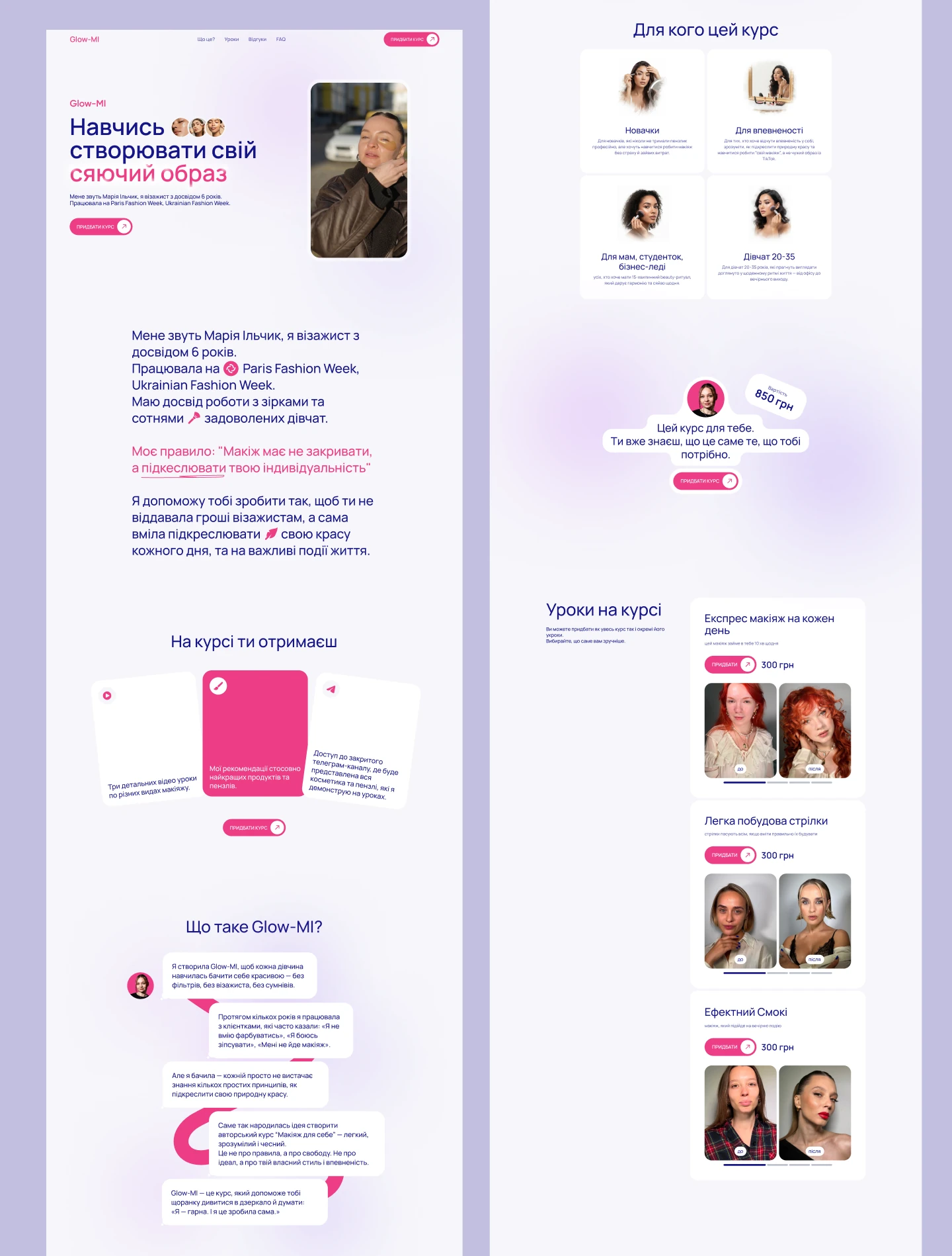
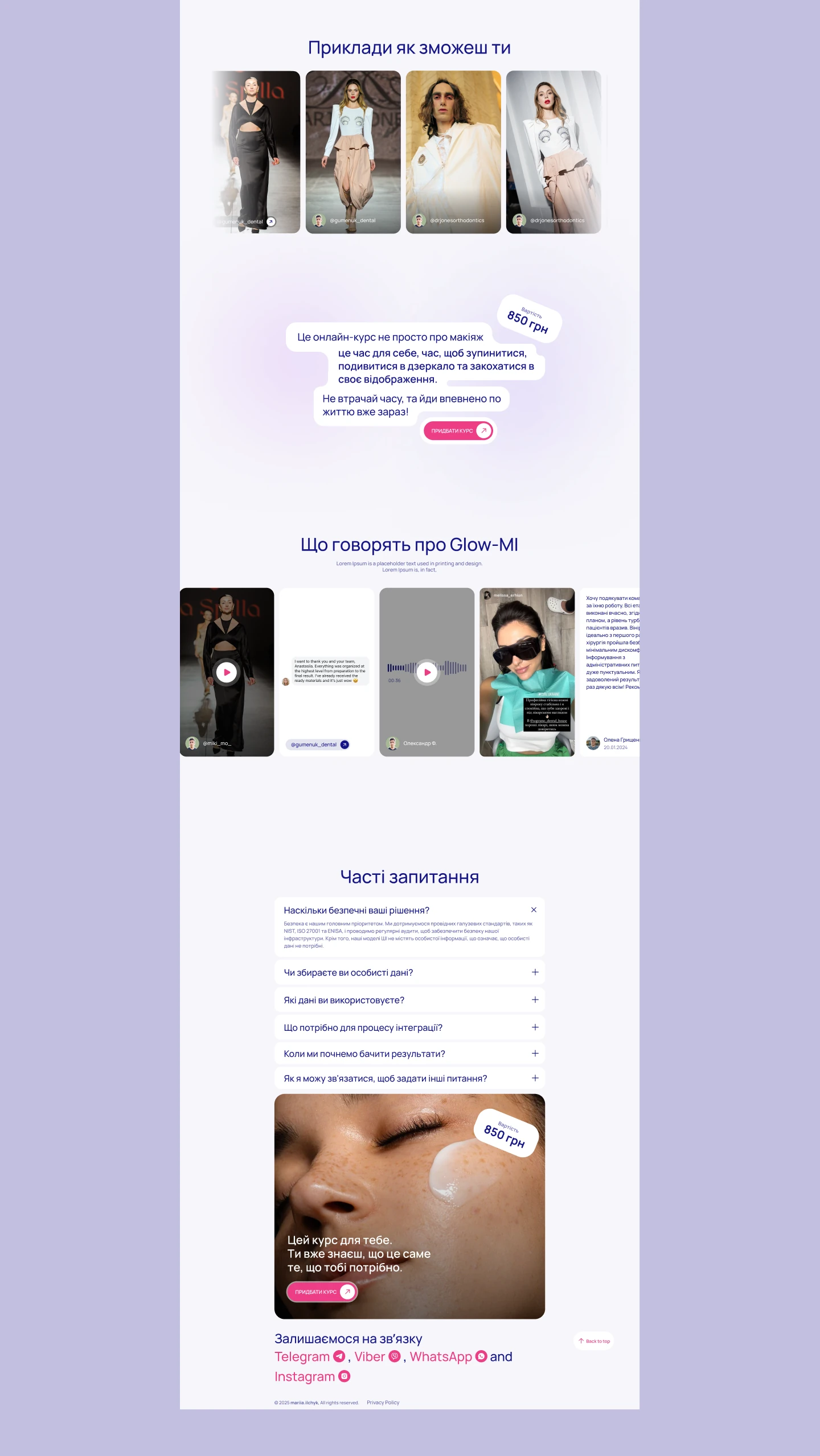
Every lesson card shows a real before/after with its own price, so a hesitant buyer can start small. Testimonials come in the formats people actually send — video, voice messages and screenshots — which reads far more honestly than typed quotes.
A floating 850 ₴ price sticker and a repeating "Buy the course" button follow the whole scroll, and an FAQ block removes the last objections before the final call to action.
This audience arrives from Instagram and TikTok, so mobile isn't an adaptation — it's the primary screen. Cards stack, the chat story keeps its rhythm, before/after pairs stay side by side, and the buy button is always within thumb reach.
A personal-brand landing that sells trust before it sells a price.
Story told as a chat — the author's real voice instead of a formal bio.
Before/after proof on every lesson, plus testimonials in native formats.
Two clear entry points — full course or a single lesson — with a CTA that follows the scroll.
The design work here wasn't decoration — it was sequencing belief: her story, women like you, real results, then the price. By the time the button appears, the decision is already made.